Friday, December 10, 2010

Point Final

For this final post, I want to focus on relating the new, 'modern' day styles back to the very beginning. First of all, we have seen how architecture has progressed throughout history, whether for better or worse. The overall concept, I think, in class was that of commodity, firmness, and delight. At the very beginning of society (or where we started in class) the people built to achieve commodity for the most part. Firmness is definitely seen as well though, because most of these are still standing today. They built structures to accommodate their needs. For example, Stonehenge was one of the first structures I remember talking about. We are not sure exactly why it was built, but one theory is for worship purposes. In the next several decades, the main architecture continued to be about religion and worship (the Greek and Roman) It was not so much about the homes, but about the experience within -most of the time- large structures that was important (now the Gothic time period). Architecture was in the stage of being built for the community, not so much the individual. Though it was individual in the sense of the person experiencing the space, most of the spaces were large and on a scale that made the person feel small. Important architects were not designing homes for the individual, so the people made do with what they had. They basically took the large, grand size buildings and scaled them down to the size of homes. Let me say, this did not work out so well, especially within the Victorian era (too much bric-a-brac is never good). During the mid 1900s, something shifted. Design began to be more about the people, the individuals themselves, not the huge community areas. The home was focused on more than in the past. Unfortunately, there was another side to this phenomenon, one where the architect/designer could care less about the people and more about the delight of the structure. This is seen big time with the design of the Guggenheim in New York. It looks quite interesting and has a very unique design. But, the concept of rounded edges in a museum was not a good one Mr. Wright. As we deliberated in class, this was a complicated issue to get around while hanging art, or even looking at it for that matter. I feel that it is difficult to engage in an art piece with noise going on about you. Again, that is the case here. There was space in the center of the structure which provided light to all the levels and yet also allowed much noise to travel upwards from the lobby. I do not feel that Wright met the requirements for commodity. In the present day, architects have become quite egotistical. They just want the things they design (specifically in the commercial standpoint) to look interesting, not to necessarily be able to perform well for the humans that inhabit the space. As far as the residential design goes, this has had a huge uprising in the past few years with HGTV becoming a sensation. There are still egotistical designers in this area, but a little less I think because in this case, the people you are designing for have to be thought of, or else they will not hire you again, like Wright. He was not a popular residential designer. He did become famous, but he might have had a more successful career if he listened to his clients.

Anyway, I believe that throughout this whole time, there has been a lot of give and take between who the design is for, but ultimately an expression on the culture of the time, whether looking backwards or forwards.

image found here
I thought it would be a nice bookend to the semester to end how Patrick did will the same image and metaphor. We are still continuously adding to the information that is on our backs, taking with us the old and adding the new. I learned so much in this class about history, the architecture that comes with it, and what that means in regards to the power of 10. I cannot wait to continue on this road of design, incorporating the things I now know into what I design in the future.

Sunday, December 5, 2010

Reading Comprehension 7

We were asked to go to the Weatherspoon museum on campus and look at an exhibit and then discuss it. One photo I truly appreciated was 'Migrant Mother'. This photo was made while the Great Depression was in its prime. You can look into this woman's soul, and I felt that is what I did. I drank in this piece for a few minutes time, just standing there, looking at every character line on her face; I couldn't believe how moving this image was. The way her gaze is so steadfast and furrowed, allows me to be in her thoughts. There is so much there, beyond those eyes, and I want to help ease that hardened look. I believe this photograph genuinely depicts the terrible time of the Great Depression very well. It has become the photograph of that time period, and I can completely tell why. For the more technical side of the photo, there is symmetry because of the two children framing the mother. There is not much contrast, but there is a depth-ness to it. You can see every line, horribly and wonderfully pronounced within the image. The coloring is perfect for the meaning of the photo. I was once told that "painting a person in color paints their clothes, while painting them in black and white will show their soul". This is exactly true here. It makes such an impact in the muted tones.
There was another photo that I really liked as well. It is called Olivia. The photographer must have used a slow shutter speed for this one because her skirt is blurred, showing movement so vividly. Again, it is in black and white. For this one though, I would have liked it in color. I could see the twirling skirt made out of a super bright color and it being a crisp spring day. I diagramed it as follows:
I think, as I stated before, that the photo exudes movement in a circular motion. My diagram shows the constant flow of going around and around, almost as if it were going right out of the box. It uses much repetition, that's where the movement comes in. It is intriguing to note that the movement happens on the bottom of the photo. The top 2/3 of the image is quite stagnant and so therefore the movement at the bottom third really catches your eye. This concept makes your eyes travel through the photo. Great job on the photographers part. I thought this was a wonderful photo with plenty of joyful spirit.

Tuesday, November 16, 2010

Reading Comprehension 6

1. A common theme of the early twentieth century found in Roth, Harwood, and Massey set the tone for an understanding of styles in architecture and design influenced by fine art. Selecting either Arts + Crafts or Art Nouveau, TRACE the influences of the selected style in more than two nations. In your answer, you should include evidence from the readings and at least two annotated images as support for your analysis of influences.

I am choosing to look at the Art Nouveau style in America, France and Germany. America does not jump on the bandwagon with this style because they are not into 'the style's associations with decadence, the erotic, and socialism' (Harwood 484). The main places that you see this style become apparent are in art glass, ceramics, decorative painting and specifically lighting by Louis Comfort Tiffany. So this style mainly stayed within the confinements of accessories here in America.

Image found here

Now for France, people embraced this style. They wanted to stay above the curve of design and so introduced schools to teach Art Nouveau. Many people thought that the style helped with living conditions. It was then configured into the design of private buildings.

Image found here

Though Germany was searching for that national identity, they did not gain it with Art Nouveau. The movement of Art nouveau there was called the Jugenstil (young style). These young people focused on the interrelations of designer, craftsman, and manufacturer. This eventually led to the inspiration of the Bauhaus school. Germany was also like America in the fact that this style had a minimal effect on architecture and more on artifacts.

All of these nations, whther focusing on architecture or more on accessories, they began with quite fluid, moving, curvilinear non symmetrical aspects and transition in 1900 to having more straight linear moments within the design. Some of them (like the Glasgow School of Art's library shown below) even to the point that I could hardly tell they were considered to be during this era.

Image found here

2. Originating at the Bauhaus and in the work of LeCorbusier, the so-called Modern movement deeply influenced design and architecture of the twentieth century. The great debate raised by this new approach to design involved the presence of the machine in the design process and final products. SPECULATE about the implications of “machines for living” and the famous dictum “less is more” on design today. Use at least one ARTIFACT, SPACE, or BUILDING in your answer, providing a salient image (cited) and annotation to help bolster your argument.

To figure out today, we must first look back to past years to Ludwig Mies van der Rohe. He designed the German Pavilion in 1929, around the sole fact that less is more. Harwood states that Mies’s stlye is “severely plain, geometric…that relies on careful proportions, precise details, and opulent materials rather than applied ornament for beauty.” I think this is stated quite well and depicts the intention of the space. I think that Mies possibly wanted to show that even through this time of depression, things could still be beautiful without lavish furnishings and decorative accessories, things people could not easily obtain during this time. Looking now to the present, I believe we strive for this same concept; at least I do. I would rather save and live comfortably than splurge on big ticket items or many various items. I make do with the things I have and try to use them as efficiently as I can. I would love to do this in design, as I have seen already. I believe there is a show on HGTV that incorporates using the same things one already owns to revamp a space. Reusing your things to save big!

Machines help to save time and money. In the German Pavilion, machines were used as we learned in class to help form the onyx walls. I am sure it saved money by the pieces being manufactured, but someone, a person, still had to install these pieces, therefore ultimately requiring human help. Some machines, like stoves or even microwaves allow us to get things done faster that would have taken longer a few centuries ago and required actual burning wood. In this case, without these machines, how would we go about our daily lives? How could we cook without them?

Image found here
This image of the German Pavilion articulates what I was referring to in the above writing; the de materialization of the space, the simplistic 'less is more' motto is shown very clearly I think.

3. From the assigned pages in Roth, Harwood, and Massey, SELECT an image that you believe explodes the notion that Modern interiors and objects were black and white. Fully RENDER your own design exploration of that image through color, material, and light and appropriately annotate and cite the image to prove this point.
The original image:
Image found on pg 506 in Harwood
Rendered Image:

Saturday, November 13, 2010

CHAIRS

During my History and Theory of Design class, we had an assignment where we drew and identified chairs every other week. It was a great way to learn these chairs, to be able to know them in the future. I have already seen some of these in my day-to-day life and it's awesome to be able to really know what the name is and who the designer was. Here are all 50 of mine:


Thursday, November 11, 2010

Alternatives Summary

For this post and the one below, I am obviously summarizing something. That is, I am drawing from other students and opinions from what we learned in the past two sections. Now then, here it is: I choose to look at three people, who are Nikki, Corry, and Dajana. All of them seemed to be on the same page in this unit. They thought that rules had to be broken in order to gain new ground. This is so true. Nikki shows this nicely with her image of a theater (I think it is).
She talks about this image and aptly states that, "If we did not have people like this [wanting to break the rules] then in the world of architecture we might still be living under four beams and a roof." I think this to be a great connection back to the image but as well to the unit. While Nikki spoke on the broader scope of things, Corry and Dajana took a slightly different approach. They decided to talk about specific buildings and their impact on the design period.
I learned one thing from this exercise which was that the creativity of the Baroque and Renaissance period was appreciated so much that it transferred over to the Americas. I guess I had not thought of it in that light. I agreed with Corry though, when he talked about how reflections are always going to occur, just slightly differently than the were in the first place.

Reflections Summary

Within the reflection unit, we learned that the past styles come back in later years. Nikki, Corry, and Dajana all agreed with me, though they had some of their own interpretations that came along with it. Dajana stated that the one era that was looked back upon was the classical times, and this stirred up much debate on what exactly 'true design' was. I thought this was a good point because everyone has various ways of looking at style and I feel as if architecture is constantly trying to get sorted out. Nikki talks about the new world and the new architecture that came to be there like (Corry referenced this by talking about Monticello; the temple on the hill, as Nikki said).
The Americans needed some powerful style that encompassed firmness, boldness, and strength. so guess where they looked? The classical period! We are continually traveling back and making what was old new and revitalized. Corry provides the perspective that even though architecture is reflected, that could be bad and not good. I believe that goes well with Nikki's idea of the New World. That architecture said power, but I think that if they really wanted to show they were independent, they would have thought up and executed their own style of architecture.

Monday, November 8, 2010

Unit Reflection Point

This unit we focused on reflections of the past and conversed about revolutions. The industrial revolution is one of extreme importance but the political revolution also impacted design in a big way. We learned that revolution consisted of several concepts that relate to how or why revolutions happen: reform, renaissance, revival, rotation, and cycle. All of these make a critical statement to the functionings of a revolution. It is all a continuous cycle; after all, a revolution is the end of a cycle and a beginning of another. This reminds me of The Lion King. If you will permit me let’s be kids for a second. I have a quote that helped me put this concept of cycle in perspective.

Mufasa: Everything you see exists together in a delicate balance. As king, you need to understand that balance and respect all the creatures, from the crawling ant to the leaping antelope.
Young Simba: But, Dad, don't we eat the antelope?
Mufasa: Yes, Simba, but let me explain. When we die, our bodies become the grass, and the antelope eat the grass. And so we are all connected in the great Circle of Life.”

In our design world terms, we can call it the ‘Circle of Design’. And it’s all true what Mufassa said, we just have to put it in perspective according to architecture and design. Over the years, we strive to see a certain style grow. Then we ‘eat’ that style; we want it gone, and a new style comes into play. Yet, that style that was eaten might come back and bite us. We remember then what that old style was and say to ourselves, “Huh, that was a great style, but let’s make it different; let’s make it better.” This is the same concept as well with how fashion continues to loop back around to the styles that were popular years and years ago. The -almost- identical thing is happening. There are so many connections, can you see them? Everything continues to come back around at some point or another. The thing is though, you can never conclude that exact time when it will come around again, for better or worse.

In this case, the industrial revolution was in reaction to new materials being made faster and easier which, I think, can be related back to when concrete was invented. It helped to make those arches easier and then prompted the ‘era of the dome,’ so to speak. But the main materials covered in this revolution were glass and iron. Various designs could now be made that before were just dreams. These new manufacturing inventions helped to ultimately make these structures come to pass: the Eiffel Tower, Biblioteque Genevieve, Burlington Arcade, and the Crystal Palace, among many, many more. The only limitations were how much money you had and how much space you occupied. This is actually slowly becoming the trend in architecture as we continue in time, but the people used this concept in different ways. I will talk more about this though within the next Point essay.

I think that this photo represents this unit well. Some things are reflected, but the reflection is not exactly the same. It might even be better in its own artistic form.

Monday, November 1, 2010

Reflection: Clock

This is my clock project. I enjoyed coming up with the idea and executing it. I chose to do the form space shown by word (LATE). I played with this idea by using the white rabbit from Alice and Wonderland and his famous saying, "I'm late, I'm late, for a very important date" which also relates back to the time/clock theme. I put this in Castle Howard's interior. We learned that the interior stayed in a gothic style, while the exterior showed the new style, which was the Renaissance. So I am stating that the interior was 'late' in it's revolution, unlike the outside. As with each of these projects, we needed to include nature, material, people, and symbol. The ways in which I included nature, material, and people are fairly self explanatory, but I will elaborate more. The hedges (nature) are specifically drawn from the garden outside of Castle Howard. The people are shown with the white rabbit and the woman garbed in 18th century (the year when the castle was built) fashion. This time period is the beginning of people doing their own thing and figuring out how they want things to look. This project is symbolic of this concept. Maybe the Howards liked both the Gothic and Renaissance style. Also, just a side note: The text is not quite centered in the middle of the image on purpose. The castle is divided, like I stated, between the two styles, and therefore having a non-copacetic feel to it, just like the words in the image! I really like this project, and I had fun with it; though now I can't get that phrase out of my head.

Wednesday, October 27, 2010

Perspective

This was my perspective project. I have included where I started at the beginning so you can see my design process, if ever so slightly. My thoughts on this project, especially since it was a 'perspective', was that the Neuschwanstein castle was to be the main focal point, the inspiration and symbol, if you will, for Walt Disney's Sleeping Beauty and Cinderella castles. They both were Disney's perspective of Neuschwanstein castle, capturing the fantastical and romantic aspects. As you can see, I included Cinderella and Prince Charming in the final. Prince Charming has already thrown a snowball at Cinderella (you can see it on her dress) and now he has another one, so she is running away. I thought this would be a cute antidote, considering that at one point the castle was used for a getaway, to relax and have fun!

Monday, October 25, 2010

Unit Alternatives Point

Throughout the alternatives unit, I felt as if the cathedrals were a very important topic and focus (good cocktail party conversation!). We saw how these buildings, structures, or art pieces illustrated what was happening within the time periods there were built. Many of them, specifically the Amiens Cathedral, were designed according to the golden rule and then added to in what seemed complicated, but truly was not. Watching the animation, it seemed as if the layers of the structure just continued and continued. Just looking at the now standing structure, you would not be able to say this is how it was designed (layout wise). You would however, be able to look at it from the ground up and see exactly how it fit and worked together. It is just amazing. I feel that the design of these complex structures eluded and translated to what was happening within society. Things were starting to happen, just as the artists/architects/designers on the outskirts of the Roman towns put their own spin on it, the same thing was happening here. The designs of the structures were branching off from what the normal architecture would have looked like. The religious people were attempting to make the church beautiful to draw people in. They did not rely on just what was taught to bring in people, but were enticing people with its beauty. They were changing or altering the way people viewed the church. Several key points about that enticement are as follows: there was an upward lifting sequence transforming to infinity, flickering fragmented glimpses, and the crossing square as the organizing geometric matrix. The organizing geometric movement was seen virtually everywhere in the cathedrals, but it was also used in other buildings as well.

Basic shapes are extremely important in everything. They are so simplistic, but when they are played with and altered from the original form, can turn into something very interesting. This is true not only in the Cathedrals we saw, but in other buildings as well. The Chateau Chambord is a nice illustration of this idea. On the bottom, Roman influence in seen everywhere your eyes travel. This is pure, simplistic shapes. On the top though, what you can see from far away, shows the gothic, the newer architecture. Putting them both together though, is a statement all its own. This takes what has already been done and (here’s that word again) alters them into something that has a completely different meaning than before, when they were used originally.

Shapes continued again along with stacking at the end of this unit when we discussed the Palazzo Medici. I learned from class and outside, how this was a nice transition to the reflections unit. First of all, the home defined society and its movements quite well. The most vivid example was how there were three floors or layers to the building. Each one served a different purpose and you could tell that by the stones, the material used for the structure. The stones at the bottom were very rough, where the peddlers and servants (working class were) but as you traveled heaven wards, the stones were smoother and more refined, as were the people. This elevated process showed that refinement or alteration was on its way!

I thought this picture was a great illustration of this unit. It was all about thinking out of the box, and coming up with new things to try. Designers thought of alternate ways to show something in a different light. They put a new spin on things and I know it will continue.

Sunday, October 17, 2010

Reading Comprehension 4

I will unfortunately not even attempt to describe the questions; just look as you will:


1.
2.
3. My interpretation of Girolamo Frescobaldi’s Balletto Terzo. Labeled as requested.

4. I believe that the Baroque period was a show. It was directed by wealthy people that wanted to boost their importance within social circles. Do not get me wrong, I enjoy the Baroque style, with its flamboyancy and naturalism, but it can be a little much. As Harwood states, "this time period flourishes with extravagant balls, receptions, and entertainment. Manners grew more refined in this age of great theatre, music, and opera." I bet it was fun to live in those wealthy circles and enjoy all of that wonderful entertainment, though it would have been horrible to be at the other end of the spectrum.

Reading Comprehension 5


1. Picking an artifact and relating it to the evolution of design:

During the beginning of the Renaissance, architecture and design were transitioning from the Middle Ages where private spaces were sparse. This affected artifacts as well, like the candlestick. It began as purely simplistic, made out of iron, brass, and other materials, not having decorative features. It was used for light mobility purposes, since the interiors were fairly dark.

The times flowed into the Rococo experience, which is hardly considered a style phase, except towards interiors and accessories. The candlesticks definitely went with the flow of this and evolved more. These newer ones were smaller, curvilinear, and more naturalistic than those of the Baroque or Renaissance before it.

If we were to travel a few more years up the road to the present day, the candlesticks are almost obsolete. We have candles, but not to deliver light to carry around. They are more for the aroma they give off. We do have a modern day candlestick, which I think is much safer; you won’t get burned! It is the flashlight.

I believe the further you travel in time the more light is needed or wanted within the home. We have advanced our lighting fixtures to the point where we rely on electricity and things that are battery-operated. We are continuing to expound more and more on technology that soon we might do away with the candle all together. We have done so already, at least with its original intent, to provide light.


2. Choosing an artifact, a building, place and space of the Eastern 19th century and relating that to Western architecture/design.

Artifact: women's dress-

http://blog.aurorahistoryboutique.com/images/early-1800s-fashion-2.png

The fashion changed dramatically during the 19th century. At the beginning of this century, the dresses were padded, had fluff, and corsets (much like the architecture). Then they came to be about the moral beliefs at the time; being formed more to the body, but graceful and light. People were in general more open and free, not bogged down as they were before. It was influenced, some say, by nature, but was all together meant to be more visually appealing than before. It became easier for goods and ideas to travel across the sea and therefore more women were dressing like the English; they received much criticism for that. So even though we were an independent country, we still looked like the people we separated from. The women did not know where to turn for new design, so they fell back on the English way. If I would have been there, I would have done my own thing and had a completely different look and style.

Building: Monticello-


Monticello was obviously inspired by Palladio's work. The structural columns being shown relate to his style as well, but show Thomas Jefferson's interpretation of them. The whole building was Jefferson's interpretation of various designs. Since this was built over 40 years, there were many changes and different styles that came into the spotlight influenced the building's architectural details. The dome on top of the structure has been greatly influenced by Europe and the previous design styles. It is seen in many, many structures in America.

Place: Pleasant Cove, Diamond Island
This port illustrates the early settler's way of life. Maybe in this area there had not been much growth and building yet. I see that there are people from every facet in life, showing that there was a wide variety that would have lived here. There is not much else to say about them, except to comment on the scale of the place and the people. This is a vast area. The people look quite small compared to the land and the trees. This is different than in England, possibly, where there were more people and crowds.
There were not too many ships coming into this port compared to those in England, at least in this image. The ships from England, come to think of it, would probably not be able to pull up to the shore. You can see that the small vessel in the background needed a paddle boat to get passengers or goods to shore. Maybe the people here didn't want this port to be huge, like the ones across seas. They might have possibly liked the small scale venue; it's less crowded. It would stay less crowded as well, if there were not ships coming and going constantly.

Space: Biltmore Estate Banquet Hall
The banquet hall is a prime example of the Americans stealing from the English. This is also right in our backyard. The furniture is done in the same style as the English, including the lavish extremes of the wood around the space. The tapestries as well were popular in England at the time. I am quite surprised though that the table is not round. I suppose it is a large table, but it seems to me that these people that came over to America and formed this new nation wanted to be treated as equals instead of lower class individuals. This table does not reflect that thinking. I think that they got away from the portraits on the walls, and instead have the animal heads. This could possibly represent the new worlds morals, everyday practice. They had to get food somehow. They did incorporate the portraits like the English with the figures along the top of the wall, I cannot tell if they were carved into the structure or a painting of sorts.

Wednesday, October 6, 2010

Unit Foundation Point


A foundation is the most important aspect of anything that requires continual process and growth. Without one, whatever is coming next will crumble. I believe this with all my heart, which is why I tried my best to learn as much as I could with this unit, so that I could get the most out of the ensuing ones. I appreciated that we began with the definition of stacking and how that presents itself many times throughout this unit. The pyramid is full of the stacking concept. The whole structure is stacking stone upon stone. Along with that, the physical exertion of climbing to the top represents the difficulty of rising up the social ladder, a near impossibility during this time. These pyramids established the axes; horizontal and vertical. The horizontal illustrates the life cycle here on earth and the vertical axis relates to the relationship between earth and gods. During this time the Egyptians believed the earth had four corners. The gold that adorned the top of the pyramid threw the light down each of the four corners, traveling to the ends of the earth. I thought of this concept again with my Eiffel Tower project in studio. The structure is actually positioned so that the points are at each North, South, West, and East. I wonder if Gustave Eiffel pulled from this same idea (concept?) when designing the placement of the Tower. I really saw how male and female concepts were attributed to architecture this early in history. I felt that this idea was apparent wherever you turned beginning in Egypt, continuing with the Grecians and then the Romans (the wu-wu!). I am excited to learn if this is incorporated within the next centuries. We learned as well that there were three ingredients that are always included within architecture; these are a porch, court, and hearth. I have seriously debated these over the course of the last few weeks and it is true! They really are an integral part of architecture! What really astounded me when we traveled to Greece was their sense of detail. In everything they did, nothing was forgotten. Every jot and tittle were thought about and made important. Where this made an impact for me was at Athens. The Parthenon is such a significant feat. The columns here were not placed exactly the same distance apart. They had slight variations between them so that the distance looked the same when seen from the entrance into Athens. Also they were not perfectly plumb either. If they were extended above the framework of the structure, they would all meet at a point 1.5 miles above the temple stylobate. I cannot believe someone actually thought about these things and then proceeded to carry them out. Absolutely amazing. Hall states why such care exercised for this building: “…arête, for the home of the goddess required the most excellent materials and most exacting workmanship. It was done because the Greeks could do it.” He goes on to say that yes, the structure is now in ruins, but not by fault of construction. It was all to do with human calamity. Of the ten structures presented to us, included in the cities around Rome, I realized that I could not choose just one I appreciated the most because they are all integral parts of this time period. I look forward to seeing many more of the themes we learned in the following segments: stacking, male and female, elements and principles of design, three ingredients of architecture, and sense of detail.


I feel that the Pyramids of Giza are a great representation of this unit. They are at the very beginning, first of all, and have many relations to the afore mentioned main themes within this unit.

Friday, October 1, 2010

First Project

We were asked to do many things for this first project. We were given four buildings to describe and illustrate using 4 methods: 2D, 3D, a word and a paragraph. All of these were to be within the confinements of four 8 1/2 in squares. I am speaking now after I finished the project and I did not include the things I needed to at the time of turn in. That being said, the rest of the assignment was to also include within each one how people, material, symbol and nature are involved. My four structures were
The Baths of Caracalla,
Viipuri Library,
Providence Arcade,

and Bleinheim Palace.
I made a tray out of a frame and used an artifact of the Providence Arcade for the handles. The other ones definitely needed to be more creative, so the next few projects will make up for it. Here is the final...


Reading Comprehension 3

[1] Look at http://www.uncg.edu/~pllucas/Gothic%20Cathedrals/website%2003.31.08/timelineNEW.html to find the questions. Great graphics!

The architect had high ambitions for Florence Cathedral. If the physical collapse of the building really meant the failure of the church as well, there was pressure to make sure this went according to plan. The people that were a part of this process wanted to see the Church and Christianity rise again. They played a vital role towards the church eventually becoming an integral part of society by continuing to design and reevaluate again and again to make the cathedrals the best. This design included commodity, firmness, and delight. Those that go to church today in huge structures want them to look pretty and be able to accommodate the needs of the congregation. As far as lessons learned, we need to make sure ten times over that our designs can withstand.

Cologne Cathedral is much like Amiens, especially to the plan and height as well as with the flying buttresses and the two towers. The one thing that is different though, is the spires that are entirely Germanic in style. This shows there is a slight variance between the two region styles. All of the similarities unite them together but the small different details make them unique. I feel that the number of towers go back to the male and female concept. With two, you walk through the middle of the towers, which could also signify insignificance while as with one, could signal importance.

The Salisbury Cathedral was able to be built however long or wide the architect wanted because there was nothing preventing it to be so. They were able to have free rein; to not have to be concerned about fitting in with the area around it. I think Amiens was stuck inside this town and it was then the designer’s problem to figure out how it would look best. Salisbury makes more of a statement and is much more regal and majestic because of its landscaping, whereas Amiens is a part of the city.


[2] This illustration from A Medieval Home Companion depicts woman at work in a medieval interior. Unfortunately, the image is closely cropped so we don’t see much of the rest of the dwelling in which she works. Using Harwood and Roth, complete the rest of the scene using words and images to demonstrate your understanding of the domestic medieval interior.

These spaces were not as grand as the cathedrals by any means. As this image shows what looks to be the kitchen, it would probably be less decorative than any other part of the home. The interior of a secular dwelling would have the following: much color, decorated with hangings on the wall, and had (if any) box-shaped furniture. There would have been a patterned stone floor, small diamond-pane casement windows, a wood beamed ceiling, and a large stone mantel. The image I am including is from Harwood and depicts a kitchen, though this one does have a good deal of furniture.


Wednesday, September 29, 2010

Assignment 2.0

This next part to the structure project involved us diagraming even more in-depthly. I decided to branch out from the typical one page presentation. Also we were asked to make our diagrams 3D and build models. You can see my models of the diagrams underneath each.

Assignment 1.0

For our project in Visual Communication, we were asked to choose a building/structure that we enjoy. I choose the Eiffel Tower. Throughout the course of the semester, we are going to explore many aspects of the structure. With the first part of this project, Travis (our teacher) asked us to use diagrams to talk about the structure. I was encouraged to divert away from the iconic triangle power statement of the Eiffel Tower.

Tuesday, September 28, 2010

Portfolio Showcase

We were asked to showcase our talents with past work from last year. I decided to use ribbon to help your eye move through the presentation and I am challenging myself to continue that ribbon concept throughout the semester with all my projects.

Monday, September 27, 2010

Compass

This was our second project in History and Theory of Design. We were to choose an artifact, space, place, or a building from the previous unit. Then we needed to decide whether it was going to be in 2D, 3D, word, or paragraph form. After those were decided, we were to then use our own interpretation of a compass to compose something that included or addressed the following: elements an principles of design, people, nature, material, and symbol. I am quite proud of how this one turned out, considering the last project. I definitely proved that I can do WAY better than before.

Scale: artifact
Form: paragraph

P.S....here is the paragraph in normal format; the 'key' if you will, to my compass maze.
Hieroglyphics (accurately hieroglyphs) are one of the most fundamental illustrations of language from the Egyptians. Some might argue that the earlier drawings seen on caves, such as in Lascaux, are the most fundamental language. Hieroglyphs, though they tell a story, actually form words or sentences from the images and are (what I think to be) the most simplistic form of writing. These images include animals, objects, or things referencing their gods. They were mostly used on papyrus (with ink made from soot, gum, bee wax, and/or plants and written with a reed brush) or on pyramids (carved, with paint). Nature played a key role in keeping this language intact. The Egyptians used natural ingredients for the ink and the writing instruments. Hieroglyphs were utilized for communicating within the society, decorating, and keeping records; we realize that these images are a symbol of the Egyptian’s lives. It allows us to be a fly on the wall and travel back many years to that time period, and learn. As far as today, this language is still amazingly around. No matter what came about in all these years past, some of these artifacts managed to survive, just for us. It shows us what their lives were like; and thanks to The Rosetta Stone it is certain we do not have a Macaulay situation on our hands. No misinterpretation here! Maybe we cannot gaze in as deeply in this society as to those in Pompeii, but it still allows us to catch a glimpse of the Egyptian people’s story.

Wednesday, September 15, 2010

Reading Comprehention 2

[1] Hersey describes a grammar for Greek architectural elements based on the idea of sacrifice. SPECULATE about the validity of his argument based on what you know about Greek design and the evidence (both visual and written) he provides. (5 points)
I feel that Hersey is reaching to find parallels between certain things and architecture. However, the parallels he does examine are interesting. He theorizes that columns can mean the foot of the structure, and then in turn, footwork, which is what the Greeks did on the way to sacrifice (dancing). I think that is a far stretch of the imagination. There are other examples he gives as well; the flutes in the column are perceived as rod, staves, or possibly (in the same way the footwork was derived) the throat. The head of the column is stated to be the (what else?) head of the throat and feet formed below. There are decorations on the top of the column, ones that may have been worn on the head for ornamentation (picture 14). I think there might possibly be validity in what he is trying to lay out, the Greeks did think of some amazing things, but I do not know that I would go as far as making these parallels.

[2] Meant in jest, Macaulay shapes a world of the future in which the main character claims meanings for archeological evidence uncovered at the Motel of the Mysteries. EXTRACT what you believe to be the lesson of mis-interpreting evidence and link that lesson to the real world phenomenon of the internet. In other words, EXPLAIN how you might avoid such a blunder as mis-reading evidence when you use the web as your major information source. (5 points)
Misinterpreting evidence can cause people to believe something that is not true. If that is all we have to go on, then we really have to get down to the nitty-gritty facts of the matter to discern what is right. The problem with that as well is that everyone has different interpretations. So, especially with the internet, we have to research and research some more until we come up with the best possible answer. We should not rely on only one source to tell us, yes, this is right. If we are just using the internet as the primary source then we should travel to multiple sights and find the common agreements. But it would definitely be best to utilize books as well. Like you said in class today, books have been looked at and edited over and over again to make sure they are accurate. They are most definitely the better source for correct information.

[3] The funerary temple design of Queen Hatshepsut speaks a very different design language than the pyramidal forms for other pharaohs. From your readings and the ideas addressed in class, RECOUNT possible reasons why Queen Hatshepsut used this building form. (5 points)
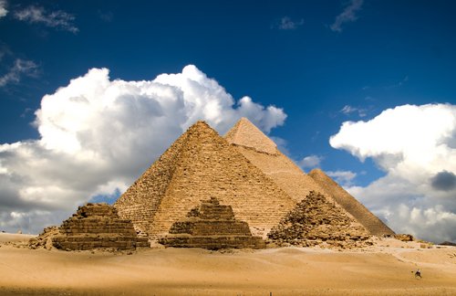
There are definite differences between Hatshepsut’s temple and the Pharaohs pyramids. First of all, the pyramids are extremely tall. Like in class, we learned that they are a statement in the middle of this flat desert. They stand out of the landscape with much contrast unlike Hatshepsut’s. Hers fits into the landscape. It is a representation of how the women were looked upon during this society. They are more of a pretty picture with not so much importance. I think Hatshepsut chose this design because she wanted to be different than the other Pharaohs before her. It provides a different statement than the giant, powerful pyramids. It is more graceful and elegant than the pyramids. Roth talks about the temple showing more of a decorative exterior (delicate faceted columns, porches, myrrh tree garden), with more of a woman’s touch than the more masculine pyramids. The temple was also an earthly paradise for Amon. The flat design of the temple could be because Queen was already, possibly subconsciously, level with the Gods. She didn’t have to reach as high as the Pharaohs. Also the stairs are believed to be a symbol of climbing the social ladder of power. It represented women in this culture and Hatshepsut’s aid to them becoming slightly more important.

[4] Although some evidence suggests links between the Egyptian and Greek civilizations, and some building forms and details provide support for that linkage, the two societies produced design responses in great contrast to one another. Select a building type (house, tomb, or temple) from each culture and ELUCIDATE similarities and differences in the two forms over time. Provide an annotated illustration for each selected type. (5 points)
These two forms are quite important to each civilization. They both have columns as the main support, but the design is different and their purpose varies slightly. The Hypostyle Hall was built for the purpose of the high priests and the religious experience received as they walk through the structure. The columns are many and placed close together. The Parthenon on the other hand, is for the worship of Athena. There is a huge statue of her at the end of the room. That means there is a colonnade here (as well as a row outside) to provide that view of her. In the Hypostyle Hall, there is not a statue as the focal point, so this design is not needed.


[5] Harwood shows examples of Egyptian furniture on pp. 60-61. HYPOTHESIZE about the lightweight nature of Egyptian furniture when compared to tomb architecture, as at the Pyramids of Giza, which many characterize as massive and heavy. (5 points)
Considering that the furniture and pyramid design languages are so completely different from each other, I think that there needed to be that contrast of heavy and light. If you were to utilize the pair of understanding of unit to whole, there would need to be a contrast. If heavy (pyramids) and heavy (furniture) were to be together it would be too much. The same at the other end of the spectrum; light and light would be lacking something. It is just the right amount of contrast between the two styles. Also, I see that there is not as much decorative features on the furniture as there is on the pyramids; for the exception of the throne of Tutankhamen. I suppose they thought that the actual architecture was much more important than the furniture that goes within.

[6] Based on a careful reading of the visual evidence in these two images, DRAW OUT an explanation of design and gender roles as you see both depicted. As this language of urns represents essentially one of the main ways we know about Grecian culture, COMMENT on the validity of such a practice of reading evidence. (5 points)
There are two concepts I get from these urns. One, I see the man in the picture depicted as being waited on, sitting down and resting while the women is standing. He is lounging in his comfortable chair. This shows the men’s relationship to the women as being much more important. Also, the artifacts the men are holding are angled upward, while the women is holding gentler, flowing, circular objects and reaching to touch his. This is definitely referring to sexuality between the two (three in the second urn). I do not believe this is the only ‘fact’ you could go on to tell about society between genders in that time. If it was literally the only artifact in existence from that time, I think it would be safe to say you could come to these conclusions. But it would be best to research the other objects we are blessed to have in our presence to truly come forth with a valid meaning.

Wednesday, September 8, 2010

Unit Theory Point

During this first theories unit, there were many fascinating ideas presented. I loved that we began with the definition of architecture, and exactly why it was the ‘unavoidable art’. I learned that there were numerous interpretations of that specific definition. Comparing building to architecture was quite thought provoking. It is an interesting concept to think that there are significant differences between the two. One of the most important topics (I think) covered in Judith’s class was touched on in class as well: how the architecture world has the past constantly on its back (like the nautilus), drawing from the history to gain inspiration.
http://www.bmyersphoto.com/BWXRAY/animals2.html

I appreciated how we separated that theory into three parts; containing integrated and finished interiors, continuing same use in existing structure, and changing use in existing structure. Now I have a foundation for looking, really looking, at all architecture and buildings (along with commodity, firmness, and delight; can’t forget about those!). Even that foundational concept was further expounded on during class with the ‘pairs of understanding’, as I like to call them. I will probably rely on these pairs to help guide my looking process towards architecture. I have actually utilized these words since class began in August. They have been applied to studio (the projects we have) and towards my two general classes as well. I found the readings so far this semester, not just in this class, have somehow related to each other. I have to continually remind myself which class the reading is specific to. In English I read about the same concepts Hall had written about; how “man has shifted evolution from his body to his extensions” and how man’s use of space is interrelated to his culture. I love that all of my classes are slowly mixing together. It makes me feel (in my general classes) that they actually mean something and I will be able to use this information in the next few years to come; I am not simply just regurgitating it through class and forgetting after it is over. This inspires me in a way and gears me towards being quite enthusiastic about my classes. Another subject included in this unit was the design cycle. This was interesting to learn about and can definitely be applied to various subjects. While watching a TV show, someone talked about clothes and how the mom had been alive so long her younger clothes were coming back into style. The design cycle! Like I said before, these facts are so absorbing; I really want to find out more. One more subject we covered that I found fascinating was the Stonehenge. All of those theories you shared with us were fantastic and extremely thought provoking. I came home and talked to my roommate about it for about half an hour. These ‘ways of looking’ truly have us thinking differently about the world; why is this the way it is and what does that tell us about those people at that point and time? You really have to use your thinking cap, going back to kindergarten for a moment, to experience all these ideas and to (in the end) gain so many new ones. I value this quote now, “You can’t know where you’re going until you know where you’ve been.” This is a quote that I believe summaries fairly well what this class will continue to expound on throughout the next few months. Cannot wait to learn about the pyramids in Egypt!