Wednesday, February 16, 2011

Jenga 3.0 Process

We are in the process of combining three individual spaces from the class into one big unit, complete with public areas for people to commune together. Here is a diagram that I am using to show how we laid out the top floor vs. the bottom. The circulation is also articulated here by dots and arrows. I have included a narrative of the circulation and feeling of the unit as well. I am excited to really push down the gas and get moving on the actual interior design work.

Our whole unit is comprised of three individual private spaces. As they come together, a circulation pathway manifests itself within the inner area. This is a two story area and can be entered two ways. Enter one way and you are near one of the private spaces, a stairway, and a reception/office space. If you come in the other way, you are close to the second private space as well as another staircase. If you proceed to travel up the stairs, they lead to the second story. This area includes a door to the other private space, a restaurant, casual seating, and an outdoor terrace. The private and public spaces are married together in a number of ways. Materials are an important factor here. Throughout all of the spaces, the concept revolves around slants, protrusions, and dynamic flow.


Another beginning part of our assignment was to illustrate main concepts of the book we read. Each of us in our group made an individual collage of ideas and interpretations of our book. The one I had the pleasure to read was the Ice Palace that Melted Away by Bill Stumpf. It was a fun read. Stumpf expounded upon better designs of several well known objects and experiences, which was quite interesting to me. I catch myself thinking quite often how certain things would work more efficiently, and he shares in my breaking down of details mind-set.

Sunday, February 13, 2011

Jenga 2.0

We all made another model! For this stage in Jenga, we were assigned one space to continue with; the one that held the most promise. We added an addition to either the top or bottom of that original space. My space was the 'in' the edge. So I continued with the same concept and translated that to an upstairs space that included another sleeping area and a work place. Overall, I think I really came through this time around for presentation. I had all the deliverables and more. That was what I was proud of the most. I divided and conquered all the requirements! As far as the layout of the board, I needed to take into account that all of the drawings were to scale. I could not make them smaller to fit better on the page. I had to work around it, figuring out the best way to communicate my ideas with several large drawings. At first, I wanted my perspectives to have a little color. Alas, at the end, that was not plausible. So I ended up having black and white, but think it turned out quite well; a happy accident!

As far as the class as a whole goes, I think we definitely stepped up to the plate and hit a triple. It was not quite a home run, but we came close. We still need to be aware of our layouts. I feel that they need more seasoning and flavor to them. Right now they are just the plain meat. So, we need to think about them along the way, not just at the end of the process. This is the same as our design process as well. We now know to design and produce at the same time. One does not come to a halt because you begin another. I am excited for this next time around; we are working in groups! I haven't worked with the people in my group yet, but it looks promising!

Here are some photos of the last phase in the project:

final stages of model...scale figures!

Tuesday, February 1, 2011

ClassmateCrits


Our class finally finished a part of this Jenga project. Here is what a few of them had up their sleeves:

Kacie Leisure began with a wonderful concept. 'Well-up' was the basis of her three rooms. She tackled the project in this way: the burst effect, elevate, and feeling. Beginning with the skinny room, she thought of the final burst whenever something wells up. The focal point and most interesting object (a column in this case) within this room showcased that process quite well. It began with shelves with space in between that gradually got smaller the higher you went. At the very top, it 'burst' into one long shelf. It was interesting the concept of bursting or exploding was flipped. Bursting is usually thought of as one thing becoming many. In this case though, she seemed to pull it off. In her next space, the square one, she focused on the elevation part of well-up. This manifested itself within the architecture (of course!) of the space. She incorporated all of the utilities of the space thoughtfully in these solids. Then the third space focuses on the actual feeling of welling up. She explores how it would look in a physical form and with many curves and luxurious fabrics/textures. For each one of these rooms, she made a model to coincide with it. These were made using the laser cutter. Kudos to her! The drawings that helped make out the space the best were the axonometric ones. You can see how it really made it easy to delve into the space.


Justin McNair showed an interesting perspective of his word as well. Spark was categorized into three other variations and then expounded upon. The three rooms were as follows: tension of striking something, the center or nucleus of that point, and the rawness of materiality. The tension room was quite interesting. He put the kit on edge, using much diagonal lines to showcase movement within the space. I think this was successful. The center, or nucleus of the spark exuded itself within the next space. Everything seemed to spread from a single point. Unfortunately with the last room, the connection with spark was not quite made. He did a great job of making it coincide with materiality, but no spark for me! All of his deliverables were informative, but the axonometric drawings really speak to the concept of his rooms and allow you to really be in the space.

Rooms with an Edge

I wanted to go through my rooms quickly, as if you we walking through the space, just to give a little more experience to the actual space.

On the Edge- This is the first space of the three. The thought I had behind this one was that you were constantly on the edge, either figuratively (about to figure out something) or physically (like on the edge), and wanted to explore and find out what was on the other side. As soon as you walk in, you are left with no choice but to go forward. There are walls on either side, with fogged glass in strips every so often, giving you a glimpse of what is behind the wall and causing you to want to understand the blurred shapes. When you reach the wall of windows, you now have two choices. Right or left? You can see a bit of stair to the right and decided to go that way. There are steps, leading up to the loft area. There is a bed right in the center of the room, and it looks as if it's floating. When you are on it, you are literally on the edge in the area. The walls do not reach all the way to the ceiling, making you have to go and look over the edge to the other part of the room. The only thing you can see here though, is a wall and then a red pipe coming up from the space. This intrigues you and you have to go down to check it out. The Bathroom is under the loft area and you check that out before continuing. Something is in the center of the room. You come closer and realize it's a sink, but wait! It is actually a bathtub if you lift the sink part up. On to the other part of the room. You walk out and around the walls, coming eventually to an area with seats, a table, and an old fashioned looking stove. That was where the pipe came from, you think. The room has now been figured out.

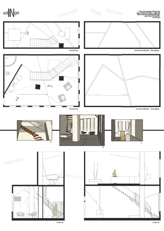
In the Edge- This room focuses on mentally being in the edge (between here and there, and having much tension), and is shown throughout with the architecture. When you walk in, the door swings and all you see is wall. This is kind of unnerving, but you continue on. Your eye is drawn to two columns toward the center of the room. These are not ordinary columns. They have steel cables coming from every which way and attach to the walls. You notice that there are several floor changes. The kitchen area is to your right, a straight, streamlined, no frills counter space. When you look closer and investigate, you can see that there is a oven, refrigerator, and sink. They are just hidden. There is a table between the two columns for eating. You continue on and see that there is a sitting area with brightly colored, what I would call 'edgy' chairs. Around the corner from that is the sleeping area. The bed frame has a frame but instead of being a box like, normal thing, it has two corners and that's all. the last place in the room is separated from everything else by a diagonal wall. It holds the bathing area. There are two shower heads in the shower, furthering that idea of being in between. I would also like to point out that the lights run along each level change, accentuating the edges of the various areas in the room.


Over the Edge- For this room, I wanted to look at it as going crazy, where things are not as they seem. When you walk in, the door opens so you see this thing at the end of the room. You figure out it's a tree. Well, an abstracted tree. The roots are shown on the ceiling as blocks and the top of it is on the ground, represented by green carpet. There are pillows on the ground, where it seems comfortable to sleep, surrounded by a lush green forest. Now, the reason your eye went directly to this tree was that there were walls on either side of the door, the angle small and then growing larger toward the tree. So, on the other side of these walls, the world is different than the lush green on this side. It has light, natural colors and smooth textures. The floor is a light wood opposed to the dark green carpet on the other side. Behind one wall is the bathing area. This bathroom holds a toilet and bathtub. There is actually two tubs, one inside the other so that the water can flow 'over' into the other one. The eating area is on the other side and is composed of a circular kitchen. It has everything in it and can be closed. A table springs out from it as well. There you go, a room that has two contrasting themes but yet the idea of crazy rolled into one.