Saturday, January 28, 2012

Design Manifesto

The ultimate factor in designing anything and everything is to design specifically for users of a space, object, or idea-meeting their needs-and then to make that atheistically pleasing.
-Anna Behrendt 

Along with this, I am including a quote from How Buildings Learn by Stewart Brand. It might not be the perfect parallel to my manifesto but on pg 63 he states, "The simultaneous seizing of power and shedding of responsibility by contractors puts the onus on architects to anticipate perfectly all of a building's needs. Nothing is left to the builders, to the client, or to the actual usage." I think that it cannot be this way. Builders, clients, and usage have to be an integral part of the design. These cannot be overlooked or cast aside. Ultimately what is designed and accomplished is for the client/user. It has to be suited for them. Designer's jobs are to aid in illustrating what the client/user expresses to us. If we have not met the need to fulfill the desires and vision of the client/user, I say we as designers have not succeeded.          


Classmate concepts

In looking at other classmate's diagrams from the last step in the analyzing process, I found that Kacie Leisure had some interesting ideas pulled from systems. I thought that her concepts from light and water were the strongest. First, the light diagram was simple and easy to read and relates itself to an actual design layout later. Her first statement here was 'a beacon of light is a form...intended to serve as a guide'. This immediately brings an illustration to my mind about what the space could be. Way-finding in this library is extremely difficult so designing this space with guides in mind could really help connect areas, allowing them to be used to their full potential.      
http://www.kacieleisure.blogspot.com/2012/01/systems-conceptual-development.html

In viewing Kacie's water concept, the sub-concept I found was 'flowing'. This goes hand in hand with her light concept in that providing a flow to the space with furnishing placement or design in general could aid in the potential utilization of the entire space.
Right now I have been at UNCG for almost three years and I have not spent time in, let alone, seen the entire library. This mainly has to do with the overall design of the space. Every time I enter, I want to leave as soon as possible. The space is broken up into sections and does not have smooth transitions that would assist to a flowing circulation.    
http://www.kacieleisure.blogspot.com/2012/01/systems-conceptual-development.html
The rest of her diagrams were informative, but I believed the two above to be the best in regards to communication with the graphics, information included, and how they pertain to the Jackson Library.

Concepts from Systems

The next step in our library process was to find concepts from systems of the building. This included lighting, electricity, water, technology, and structure. We were to design diagrams around these concepts, focusing on how they relate specifically to our library. I realized through this exercise that a concept and inspiration do not have to come from outside a project by bringing something new into it, but by looking at the existing and pulling from that. How do certain elements work in this space? How can we make them better and celebrate what is/has to be there?  


Precedent Libraries

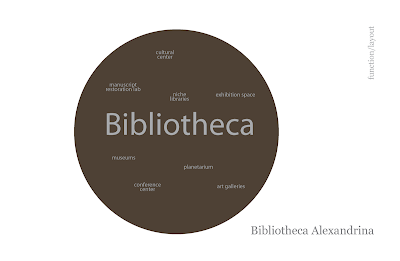
While looking at our own libraries on campus, we also looked outside of the city to various libraries around the world. The libraries I analyzed were Library of Papyri, Abbey Library St. Gaulen, and Bibliotheca Alexandrina. I found these libraries to be so different from each other in the way they are designed. I focused mostly on diagrams to capture my point but still stuck to the seven categories from our campus libraries. I have included several diagrams from the analysis. They have little blurbs to aid in understanding the concept as well as the library name. First though, I have shown the summary page for each library which include photos from the actual site. 


Music Library Light Analysis

One of the major projects this semester is to design one of the two libraries on campus. Before actually designing the space, we are first analyzing it from the inside out and then the outside in. Our first step in this process was to look at the of the space. Each person had one out of seven categories: users, systems, circulation, transition/boundaries, materiality, furnishings, and sensory experience. I was given systems which I then furthered narrowed down to lighting. I felt this was the most important aesthetic system in the space and the one that needed to be looked at the most. I made a section of the space and showed the intensity of the light in the work area as well as the book stacks. The light path and source are slightly over exemplified in my illustration because I wanted to make apparent that this lighting situation is not the best and could be (will be!) changed for the better. 

Thursday, January 26, 2012

Material choices

In choosing material choices for our libraries, we stepped back and looked not at how they were applied, but the materials themselves and attributes that went along with them. We were given the time-old marriage cliche "something old, something new, something borrowed, and something blue" in regards to our four materials. I would say that in deciding on a color scheme and the types of materials were easy but when it came to those parameters, it was tough! The four I finished out with were lace (something old-and out of the box), energy tiles (new), iron (borrowed from Abbey Library St Gaulen), and wallpaper (blue-though not necessarily on the wall). I feel that my material scheme comes together first of all by the actual materials themselves. I believe the delicacy of the lace stands in stark contrast to the hard, rough qualities of the iron and since these two were black and white, color needed to be introduced. This was accomplished from the two other materials, blue wall covering and green energy tiles. They each have their own unique texture they can bring to the space. Those were the realitively obvious comparisons between two. Now to switch them. I believe the lace has a connection with the wallpaper in that together they promote a sense of calmness. The opposite goes for the iron with the energy tiles. Though the tiles will bring sustainability into the mix, they also bring in some life into the space. They provided a type of light, a fun pop of color, and reference to a new, youthful outlook to the future. In contrast, iron has been a strong statement in many spaces for several centuries now and provides a look back, a nod if you will, to older times along with the lace.
Now secondly, my materials came together in the form of my deliverable. The lace and energy tile were included in my box which is meant to be the blue wall covering enclosing them while representational iron tied them all together. I wanted to illustrate that they could work together in a seemless way and still make an impact alone. Each one has a specific use and part within the grand scheme of things, just as would happen eventually in the space itself.
Conceptually I believe that the materials combine to form an insight from the past and inspiration towards the future. The colors ingraved within the materials were very important to me. Blue was a thought even before the parameters were given because it promotes productivity as well as calmness. The other color included in the materials palette is a spring grass green which encourages success and therefore is important within a library space. A common user travels the space believing for success in finding correct information for a variety of projects. These tiles could further encourage student success and cause an increased use of the space. Lace and iron are the ones that really bring that old fashioned, antique quality to the space, again, allowing for the fusion of the past and present to come together in a wonderful harmonious composition.

Tuesday, January 17, 2012

Response to Parametric Modeling

Parametric modeling makes digital modeling easier and more efficient for the user. This is a new approach that is surfacing in the design world. It assigns real-world behaviors and attributes to the model. For example, if the pitch of the roof is changed, the user does not need to be concerned about having to go in and change the height of the walls. Parametric modeling programs do that for you. It revises everywhere so you don’t have to. Parametric modeling also provides a schedule for the project, keeping each component of the model in a category: doors, windows, etc. If these parts are changed in the graphic model, they change on the list. Even if they are changed in the list, they are changed in the model. This program updates the changes you make for you. Not having to do steps twice makes modeling so much easier and less time consuming.
     
Having this assignment to complete has really helped me see how simple parametric programs (such as Revit) can be. This program has the potential to really help me in the future. Revit is so user friendly. Want to draw a wall? Draw a wall. It’s that simple. For me, it was straightforward because I drew the wall exactly as I thought I would draw it: by selecting the wall tool and drawing it in its desired location. There are some setbacks to BIMs, and those have to be dealt with. You have to make sure that when deleting a line or point, it doesn’t delete other important things that might be attached to it, like a wall. Some would say transitioning from a 2D program like CAD to a 3D program (Revit) would be difficult. I have used CAD and although it’s somewhat user friendly, Revit is much more so. The article mentions this great feature: “a change anywhere is a change everywhere.” This means that I don’t have to double check the cross references because it does that for me already. I enjoy that Revit has no layers. No layers means more time in my book. You will not have to consistently check to see if you are on the correct layer. The fact that you can go back and forth quite effortlessly from 2D to 3D is fantastic; which basically means having an ‘intelligent connection’ between every aspect. This allows you to see a perspective version of the project, as it would look from all angles. This is really a great feature.

So, pulling from my previous Revit experience as well as the tutorial I have worked on and completed, I cannot find any annoyances of the program as of yet. This opinion might change in the future, but I am going out on a limb and saying that I enjoy Revit now and therefore intend on using it extensively in the future. Having heard that Revit is being used in big time Architect firms, it is safe to say I would like to continue to learn and grow in this program for future endeavors.

Tuesday, January 10, 2012

Summary of Computing in Architectural Design

This article gave a brief informational history of computing in Architecture. It was interesting to see how far it has come to help in design. Towards the beginning in the 1970s, computing took on two categories. One was specifically for mechanical engineering and the other exclusively for the construction industry. This was the first generation. After these programs were initiated, a tidal wave occurred in programming. There were constantly people dreaming up and implementing new and better advances. Industries began to see immediate advantages of having this illustrative software for their designers. They were able to see new things graphically that before people would have to hand draw. This way, it was accurate. These programs were beginning to be used not only now for visualizing the design in an illustrative form but to actually solve building issues before construction even began. This first generation used more architectural ideas instead of computer science to iterate ideas. This was supposed to help the software, but it would need a few more years to mature to become truly user friendly.

These first generation programs needed large powerful computers along with expensive displays in order to actually use the software how it was meant to be. Enter personal computers! After these were introduced in the industry, it became easier, not to mention cheaper to use these programs for large firms. Thus began the second generation of CAD systems. It was initially written for Apple but other companies quickly jumped on the personal computer bandwagon. They brought with them faster, more powerful processors, better display resolutions, and ink jet printers. This furthermore allowed the programs to not only be used for architectural drafting, but for basic photo realistic renderings. They hit the scene and they hit big. Clients would not have long to wait anymore to see their projects come to life. This was a big step forward in my book for computer modeling programs. Though computer model was making a big leap forward with rendering, they fell backwards in the technical aspect. Instead of having analytical capabilities that were vital in the first generation, that was exchanged for polygons, solids, and NURBS. This all changed in the third generation.

People knew that this was not an option. These programs should have both the rendering and drafting capabilities. At various Universities, they set about making this come into fruition. They all tried fusing the non-informational solid shapes into units that would have sets of rules and qualities to distinguish them from others. They came to find out the following: “…recent advances in object-orient programming (OOP), artificial intelligence (AI), and database management systems (DBMS) are the underpinnings of the third generation CAD systems.” As of now, we are still in the third generation era. There is a continuation to make these programs better but it is difficult to pair ‘comprehensive building-specific data and knowledge bases” with that of “nongeometric attributes into an effective design support system.”  

     Computing helps not only in the architectural field. The brobdingnagian aspects of its existence is in the ability to communicate. No longer do people have to be in the same room or even the same city to talk and see ideas. They could even be a part of a meeting from their own home if they would like. In more advanced computing, the computer or program has the ability to do specific tasks for the user. The example given in the article is to tell the computer, "design a staircase between these floors" and it would. That blows my mind that we have come so far. Taking this one step further and looking outside of using computers in design is utilizing one day to day. Computers are used in security systems, automatic doors, cell phones, car systems, etc. There are little computers everywhere doing big jobs and most of those jobs never even cross our mind. Our cars have a plethora of computers running every second. All we do is turn the key and put it in drive. That is what makes it so interesting. I believe what hit me the most in this article is the fact that technology has become so ingrained in our culture. This just astounds me. Knowing where computing has come from has shown me that this shouldn't be taken for granted but to be used with tremendous gratitude. Computing is such an important and vital role in our culture today. It has come so far, but I bet it will go farther. It will be fun seeing what comes next in the computing world of design tool as well as a help in life and being a part of the process is a truly great opportunity.