Tuesday, November 16, 2010

Reading Comprehension 6

1. A common theme of the early twentieth century found in Roth, Harwood, and Massey set the tone for an understanding of styles in architecture and design influenced by fine art. Selecting either Arts + Crafts or Art Nouveau, TRACE the influences of the selected style in more than two nations. In your answer, you should include evidence from the readings and at least two annotated images as support for your analysis of influences.

I am choosing to look at the Art Nouveau style in America, France and Germany. America does not jump on the bandwagon with this style because they are not into 'the style's associations with decadence, the erotic, and socialism' (Harwood 484). The main places that you see this style become apparent are in art glass, ceramics, decorative painting and specifically lighting by Louis Comfort Tiffany. So this style mainly stayed within the confinements of accessories here in America.

Image found here

Now for France, people embraced this style. They wanted to stay above the curve of design and so introduced schools to teach Art Nouveau. Many people thought that the style helped with living conditions. It was then configured into the design of private buildings.

Image found here

Though Germany was searching for that national identity, they did not gain it with Art Nouveau. The movement of Art nouveau there was called the Jugenstil (young style). These young people focused on the interrelations of designer, craftsman, and manufacturer. This eventually led to the inspiration of the Bauhaus school. Germany was also like America in the fact that this style had a minimal effect on architecture and more on artifacts.

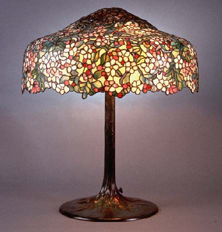
All of these nations, whther focusing on architecture or more on accessories, they began with quite fluid, moving, curvilinear non symmetrical aspects and transition in 1900 to having more straight linear moments within the design. Some of them (like the Glasgow School of Art's library shown below) even to the point that I could hardly tell they were considered to be during this era.

Image found here

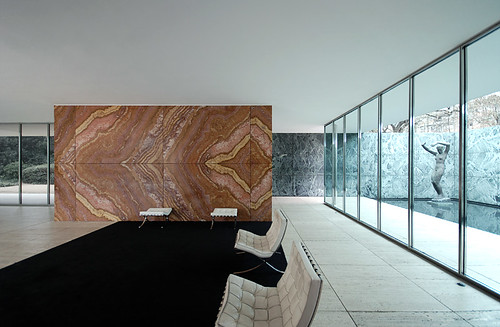
2. Originating at the Bauhaus and in the work of LeCorbusier, the so-called Modern movement deeply influenced design and architecture of the twentieth century. The great debate raised by this new approach to design involved the presence of the machine in the design process and final products. SPECULATE about the implications of “machines for living” and the famous dictum “less is more” on design today. Use at least one ARTIFACT, SPACE, or BUILDING in your answer, providing a salient image (cited) and annotation to help bolster your argument.

To figure out today, we must first look back to past years to Ludwig Mies van der Rohe. He designed the German Pavilion in 1929, around the sole fact that less is more. Harwood states that Mies’s stlye is “severely plain, geometric…that relies on careful proportions, precise details, and opulent materials rather than applied ornament for beauty.” I think this is stated quite well and depicts the intention of the space. I think that Mies possibly wanted to show that even through this time of depression, things could still be beautiful without lavish furnishings and decorative accessories, things people could not easily obtain during this time. Looking now to the present, I believe we strive for this same concept; at least I do. I would rather save and live comfortably than splurge on big ticket items or many various items. I make do with the things I have and try to use them as efficiently as I can. I would love to do this in design, as I have seen already. I believe there is a show on HGTV that incorporates using the same things one already owns to revamp a space. Reusing your things to save big!

Machines help to save time and money. In the German Pavilion, machines were used as we learned in class to help form the onyx walls. I am sure it saved money by the pieces being manufactured, but someone, a person, still had to install these pieces, therefore ultimately requiring human help. Some machines, like stoves or even microwaves allow us to get things done faster that would have taken longer a few centuries ago and required actual burning wood. In this case, without these machines, how would we go about our daily lives? How could we cook without them?

Image found here
This image of the German Pavilion articulates what I was referring to in the above writing; the de materialization of the space, the simplistic 'less is more' motto is shown very clearly I think.

3. From the assigned pages in Roth, Harwood, and Massey, SELECT an image that you believe explodes the notion that Modern interiors and objects were black and white. Fully RENDER your own design exploration of that image through color, material, and light and appropriately annotate and cite the image to prove this point.
The original image:
Image found on pg 506 in Harwood
Rendered Image:

Saturday, November 13, 2010

CHAIRS

During my History and Theory of Design class, we had an assignment where we drew and identified chairs every other week. It was a great way to learn these chairs, to be able to know them in the future. I have already seen some of these in my day-to-day life and it's awesome to be able to really know what the name is and who the designer was. Here are all 50 of mine:


Thursday, November 11, 2010

Alternatives Summary

For this post and the one below, I am obviously summarizing something. That is, I am drawing from other students and opinions from what we learned in the past two sections. Now then, here it is: I choose to look at three people, who are Nikki, Corry, and Dajana. All of them seemed to be on the same page in this unit. They thought that rules had to be broken in order to gain new ground. This is so true. Nikki shows this nicely with her image of a theater (I think it is).
She talks about this image and aptly states that, "If we did not have people like this [wanting to break the rules] then in the world of architecture we might still be living under four beams and a roof." I think this to be a great connection back to the image but as well to the unit. While Nikki spoke on the broader scope of things, Corry and Dajana took a slightly different approach. They decided to talk about specific buildings and their impact on the design period.
I learned one thing from this exercise which was that the creativity of the Baroque and Renaissance period was appreciated so much that it transferred over to the Americas. I guess I had not thought of it in that light. I agreed with Corry though, when he talked about how reflections are always going to occur, just slightly differently than the were in the first place.

Reflections Summary

Within the reflection unit, we learned that the past styles come back in later years. Nikki, Corry, and Dajana all agreed with me, though they had some of their own interpretations that came along with it. Dajana stated that the one era that was looked back upon was the classical times, and this stirred up much debate on what exactly 'true design' was. I thought this was a good point because everyone has various ways of looking at style and I feel as if architecture is constantly trying to get sorted out. Nikki talks about the new world and the new architecture that came to be there like (Corry referenced this by talking about Monticello; the temple on the hill, as Nikki said).
The Americans needed some powerful style that encompassed firmness, boldness, and strength. so guess where they looked? The classical period! We are continually traveling back and making what was old new and revitalized. Corry provides the perspective that even though architecture is reflected, that could be bad and not good. I believe that goes well with Nikki's idea of the New World. That architecture said power, but I think that if they really wanted to show they were independent, they would have thought up and executed their own style of architecture.

Monday, November 8, 2010

Unit Reflection Point

This unit we focused on reflections of the past and conversed about revolutions. The industrial revolution is one of extreme importance but the political revolution also impacted design in a big way. We learned that revolution consisted of several concepts that relate to how or why revolutions happen: reform, renaissance, revival, rotation, and cycle. All of these make a critical statement to the functionings of a revolution. It is all a continuous cycle; after all, a revolution is the end of a cycle and a beginning of another. This reminds me of The Lion King. If you will permit me let’s be kids for a second. I have a quote that helped me put this concept of cycle in perspective.

Mufasa: Everything you see exists together in a delicate balance. As king, you need to understand that balance and respect all the creatures, from the crawling ant to the leaping antelope.
Young Simba: But, Dad, don't we eat the antelope?
Mufasa: Yes, Simba, but let me explain. When we die, our bodies become the grass, and the antelope eat the grass. And so we are all connected in the great Circle of Life.”

In our design world terms, we can call it the ‘Circle of Design’. And it’s all true what Mufassa said, we just have to put it in perspective according to architecture and design. Over the years, we strive to see a certain style grow. Then we ‘eat’ that style; we want it gone, and a new style comes into play. Yet, that style that was eaten might come back and bite us. We remember then what that old style was and say to ourselves, “Huh, that was a great style, but let’s make it different; let’s make it better.” This is the same concept as well with how fashion continues to loop back around to the styles that were popular years and years ago. The -almost- identical thing is happening. There are so many connections, can you see them? Everything continues to come back around at some point or another. The thing is though, you can never conclude that exact time when it will come around again, for better or worse.

In this case, the industrial revolution was in reaction to new materials being made faster and easier which, I think, can be related back to when concrete was invented. It helped to make those arches easier and then prompted the ‘era of the dome,’ so to speak. But the main materials covered in this revolution were glass and iron. Various designs could now be made that before were just dreams. These new manufacturing inventions helped to ultimately make these structures come to pass: the Eiffel Tower, Biblioteque Genevieve, Burlington Arcade, and the Crystal Palace, among many, many more. The only limitations were how much money you had and how much space you occupied. This is actually slowly becoming the trend in architecture as we continue in time, but the people used this concept in different ways. I will talk more about this though within the next Point essay.

I think that this photo represents this unit well. Some things are reflected, but the reflection is not exactly the same. It might even be better in its own artistic form.

Monday, November 1, 2010

Reflection: Clock

This is my clock project. I enjoyed coming up with the idea and executing it. I chose to do the form space shown by word (LATE). I played with this idea by using the white rabbit from Alice and Wonderland and his famous saying, "I'm late, I'm late, for a very important date" which also relates back to the time/clock theme. I put this in Castle Howard's interior. We learned that the interior stayed in a gothic style, while the exterior showed the new style, which was the Renaissance. So I am stating that the interior was 'late' in it's revolution, unlike the outside. As with each of these projects, we needed to include nature, material, people, and symbol. The ways in which I included nature, material, and people are fairly self explanatory, but I will elaborate more. The hedges (nature) are specifically drawn from the garden outside of Castle Howard. The people are shown with the white rabbit and the woman garbed in 18th century (the year when the castle was built) fashion. This time period is the beginning of people doing their own thing and figuring out how they want things to look. This project is symbolic of this concept. Maybe the Howards liked both the Gothic and Renaissance style. Also, just a side note: The text is not quite centered in the middle of the image on purpose. The castle is divided, like I stated, between the two styles, and therefore having a non-copacetic feel to it, just like the words in the image! I really like this project, and I had fun with it; though now I can't get that phrase out of my head.