[1] Look at http://www.uncg.edu/~pllucas/Gothic%20Cathedrals/website%2003.31.08/timelineNEW.html to find the questions. Great graphics!
The architect had high ambitions for Florence Cathedral. If the physical collapse of the building really meant the failure of the church as well, there was pressure to make sure this went according to plan. The people that were a part of this process wanted to see the Church and Christianity rise again. They played a vital role towards the church eventually becoming an integral part of society by continuing to design and reevaluate again and again to make the cathedrals the best. This design included commodity, firmness, and delight. Those that go to church today in huge structures want them to look pretty and be able to accommodate the needs of the congregation. As far as lessons learned, we need to make sure ten times over that our designs can withstand.
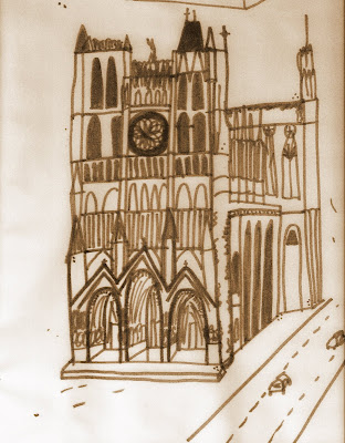
Cologne Cathedral is much like Amiens, especially to the plan and height as well as with the flying buttresses and the two towers. The one thing that is different though, is the spires that are entirely Germanic in style. This shows there is a slight variance between the two region styles. All of the similarities unite them together but the small different details make them unique. I feel that the number of towers go back to the male and female concept. With two, you walk through the middle of the towers, which could also signify insignificance while as with one, could signal importance.
The Salisbury Cathedral was able to be built however long or wide the architect wanted because there was nothing preventing it to be so. They were able to have free rein; to not have to be concerned about fitting in with the area around it. I think Amiens was stuck inside this town and it was then the designer’s problem to figure out how it would look best. Salisbury makes more of a statement and is much more regal and majestic because of its landscaping, whereas Amiens is a part of the city.
[2] This illustration from A Medieval Home Companion depicts woman at work in a medieval interior. Unfortunately, the image is closely cropped so we don’t see much of the rest of the dwelling in which she works. Using Harwood and Roth, complete the rest of the scene using words and images to demonstrate your understanding of the domestic medieval interior.
 These spaces were not as grand as the cathedrals by any means. As this image shows what looks to be the kitchen, it would probably be less decorative than any other part of the home. The interior of a secular dwelling would have the following: much color, decorated with hangings on the wall, and had (if any) box-shaped furniture. There would have been a patterned stone floor, small diamond-pane casement windows, a wood beamed ceiling, and a large stone mantel. The image I am including is from Harwood and depicts a kitchen, though this one does have a good deal of furniture.

[1] Good comparisons [2] Very nice description and connections to readings...nice supportive image.
ReplyDelete