Showing posts with label IAR 302. Show all posts

Sunday, March 25, 2012

Solutions to Studio


The Gatewood building has become- in the past 2 and a half years-my second home here in Greensboro. So having to think about, provide, and then listen to analysis about the building was quite enjoyable. Hearing what the users thought about the space and how they could potentially make it better was enlightening. There was so much information…where to start? Well I think I should begin by saying that I am so thankful to have our own space on campus. This whole building was built in devotion to the arts; how wonderful! When I would walk up the hill first year and saw ‘my’ studio at the top, it gave me a wonderful feeling in my heart. I felt inspired; that whatever I set my mind to accomplish inside, I could. As I went inside, that feeling stayed with me through the exposed systems and immense height of the space. These were also the great aspects other people loved about the building.
            As with most buildings, there are features that could be improved or changed. In Gatewood’s case, these aspects were supposed to be included in the original building plan. For some reason or another, they went over budget and decided to exclude actual tackboards, markerboards, coat hooks, ceiling baffles, storage for chairs and model stands, and wood slats on the roof where there is now exposed concrete, along with numerous others. Though these are significant, the big thing is storage: there is none. This problem causes every available surface to be covered in past projects. Cluttered chaos is not my idea of inspiration, so it is sometimes tough to stay in studio for an extended period of time. I find myself looking up, not around, for that ‘breath of fresh air’. Though looking up at the actual building gives me-at times-some needed clarity, it should continue in the ‘livable’ area; the place where people walk, move, and generally facilitate. This concept needs to be kept in mind throughout the design process. I want the space to be as inspiring at eye level as it is when looking up.
            Many of the other presentations prompted many great ideas for the studio with photos of interesting gadgets and spaces with texture and variety. One great thing that I came away with was in keeping variety. Variety is inspirational. We cannot forget each one of us has our own voice and individual style to contribute to what makes the space ours. We have to hold on to this concept as well because it is truly important. Losing sight of this would be unfortunate.
            Now, how will I make these ideas happen? Well now that happens later down the line; I am not sure yet but bringing in the ‘necessary new’ should help me to begin. I should mention that practicality is an important attribute for me in any endeavor. I will strive to find furniture, materials, and other such things that work in our studio but that also can be seen as feasible implementations soon. I will provide space planning as an integral part in my project while focusing on key areas or problem-solving aspects such as storage, technology, and lounge areas.

Friday, March 16, 2012

IARC core values

Talking about core values in IARC... photos and writing; tried to consolidate my writing.  

Monday, February 27, 2012

Music Library Design

Tomorrow is the big day! Here is the link to my presentation for tomorrow. So excited to show what I've been working on and what everyone else has as well.

Presentation

Wednesday, February 8, 2012

Feedback: Nicole


Nicole delivered a super fun space. I am reminded of Alice and Wonderland somewhat because of the color choices and the style of rendering. The space is full of and impactful with color, which is a great concept in a music library.

The columns have been given a face lift and actually make a big (positive!) impact in opposition to what they were like previously. This take on structure is interesting. She really played up the horizontal structure here and celebrated it. While making them stand out, she made them an integral part of the space; I would not know they were structural columns. This was a success I think. The next step I think would be continuing the idea on the floor as she has done on the ceiling. The space almost feels top heavy so to continue this installation on the floor would help balance that.  
The nodes in the space are placed in this grid like system which have positives and disadvantages associated with it. First of all, it provides structure and defines the area which is great in assisting with boundaries, but I think it might be too structured. With all these flowing curves, introducing square areas breaks up that concept.
The next step I would suggest is in reference to quiet and loud sections. I love that it has a cafĂ© area (I might have to incorporate that in my design!) which goes along with the social aspect. But the actual library is social as well. I think that quiet, listening areas should be established. The curved panel divider is slowly traveling in the direction of this idea, and just needs to be further implemented. I am excited to see the next few iterations!      

90 second presentation

The next step in analyzing and designing the libraries, our class looked at several pieces of writing, presentations, and surveys about libraries in general and then our campus libraries specifically. Aws and I looked a survey entitled: Institutional Effectiveness of 2010-2011. We found many important aspects that definitely need to be incorporated into our final design. The information displayed here made us change our minds in how we thought about a library. We learned specifically three new things: librarians are being trained to better serve in the customer service capacity, technology is being integrated as a vital aspect of the space, and the most asked question is how to cite correctly. Obtaining this knowledge allowed us to explore new instances with our designs. Having 'citation stations' where users could type in a book and having it cited for them would be greatly appreciated, along with a substantial amount of desktops, and a central or easily noticeable customer service area are all ideas we plan to integrate in the next phases of this project.      


Sunday, February 5, 2012

Library Presentation

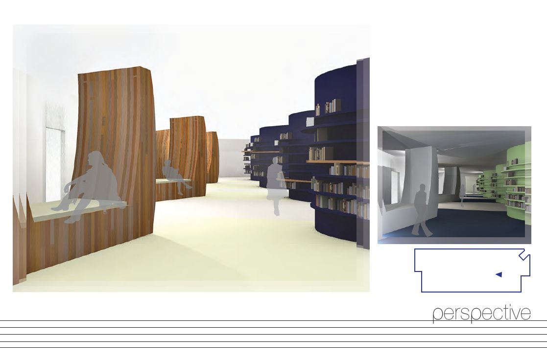
The next step in our library design was to actually design the interior. We focused on a concept and went from there. My concept is Reverberation. I saw that through all the hard angles within the building and site there are three circle areas: the organ recital hall, lobby, and little pond outside. I used radiating circles that reverberate from each of them. These arcs were used for either the ceiling, floor, or pieces in the space. These were my presentation boards:


Wednesday, February 1, 2012

Intrium critique

Today was the next critique for our continuing library project. I finally figured out where to go with my design of the space. I took Patrick's words I heart when he said think out of the box. I believe I am on the road to accomplishing that task with my idea of what I call 'pods' in the space. The following sketch illustrates my idea. This is as far as I have gotten: I haven't looked at the scale, relationship to people, or the space yet. My thoughts are to have these big installations really make the space, so we'll see what happens with them.

Saturday, January 28, 2012

Design Manifesto

The ultimate factor in designing anything and everything is to design specifically for users of a space, object, or idea-meeting their needs-and then to make that atheistically pleasing.
-Anna Behrendt 

Along with this, I am including a quote from How Buildings Learn by Stewart Brand. It might not be the perfect parallel to my manifesto but on pg 63 he states, "The simultaneous seizing of power and shedding of responsibility by contractors puts the onus on architects to anticipate perfectly all of a building's needs. Nothing is left to the builders, to the client, or to the actual usage." I think that it cannot be this way. Builders, clients, and usage have to be an integral part of the design. These cannot be overlooked or cast aside. Ultimately what is designed and accomplished is for the client/user. It has to be suited for them. Designer's jobs are to aid in illustrating what the client/user expresses to us. If we have not met the need to fulfill the desires and vision of the client/user, I say we as designers have not succeeded.          


Classmate concepts

In looking at other classmate's diagrams from the last step in the analyzing process, I found that Kacie Leisure had some interesting ideas pulled from systems. I thought that her concepts from light and water were the strongest. First, the light diagram was simple and easy to read and relates itself to an actual design layout later. Her first statement here was 'a beacon of light is a form...intended to serve as a guide'. This immediately brings an illustration to my mind about what the space could be. Way-finding in this library is extremely difficult so designing this space with guides in mind could really help connect areas, allowing them to be used to their full potential.      
http://www.kacieleisure.blogspot.com/2012/01/systems-conceptual-development.html

In viewing Kacie's water concept, the sub-concept I found was 'flowing'. This goes hand in hand with her light concept in that providing a flow to the space with furnishing placement or design in general could aid in the potential utilization of the entire space.
Right now I have been at UNCG for almost three years and I have not spent time in, let alone, seen the entire library. This mainly has to do with the overall design of the space. Every time I enter, I want to leave as soon as possible. The space is broken up into sections and does not have smooth transitions that would assist to a flowing circulation.    
http://www.kacieleisure.blogspot.com/2012/01/systems-conceptual-development.html
The rest of her diagrams were informative, but I believed the two above to be the best in regards to communication with the graphics, information included, and how they pertain to the Jackson Library.

Concepts from Systems

The next step in our library process was to find concepts from systems of the building. This included lighting, electricity, water, technology, and structure. We were to design diagrams around these concepts, focusing on how they relate specifically to our library. I realized through this exercise that a concept and inspiration do not have to come from outside a project by bringing something new into it, but by looking at the existing and pulling from that. How do certain elements work in this space? How can we make them better and celebrate what is/has to be there?  


Precedent Libraries

While looking at our own libraries on campus, we also looked outside of the city to various libraries around the world. The libraries I analyzed were Library of Papyri, Abbey Library St. Gaulen, and Bibliotheca Alexandrina. I found these libraries to be so different from each other in the way they are designed. I focused mostly on diagrams to capture my point but still stuck to the seven categories from our campus libraries. I have included several diagrams from the analysis. They have little blurbs to aid in understanding the concept as well as the library name. First though, I have shown the summary page for each library which include photos from the actual site. 


Music Library Light Analysis

One of the major projects this semester is to design one of the two libraries on campus. Before actually designing the space, we are first analyzing it from the inside out and then the outside in. Our first step in this process was to look at the of the space. Each person had one out of seven categories: users, systems, circulation, transition/boundaries, materiality, furnishings, and sensory experience. I was given systems which I then furthered narrowed down to lighting. I felt this was the most important aesthetic system in the space and the one that needed to be looked at the most. I made a section of the space and showed the intensity of the light in the work area as well as the book stacks. The light path and source are slightly over exemplified in my illustration because I wanted to make apparent that this lighting situation is not the best and could be (will be!) changed for the better. 

Thursday, January 26, 2012

Material choices

In choosing material choices for our libraries, we stepped back and looked not at how they were applied, but the materials themselves and attributes that went along with them. We were given the time-old marriage cliche "something old, something new, something borrowed, and something blue" in regards to our four materials. I would say that in deciding on a color scheme and the types of materials were easy but when it came to those parameters, it was tough! The four I finished out with were lace (something old-and out of the box), energy tiles (new), iron (borrowed from Abbey Library St Gaulen), and wallpaper (blue-though not necessarily on the wall). I feel that my material scheme comes together first of all by the actual materials themselves. I believe the delicacy of the lace stands in stark contrast to the hard, rough qualities of the iron and since these two were black and white, color needed to be introduced. This was accomplished from the two other materials, blue wall covering and green energy tiles. They each have their own unique texture they can bring to the space. Those were the realitively obvious comparisons between two. Now to switch them. I believe the lace has a connection with the wallpaper in that together they promote a sense of calmness. The opposite goes for the iron with the energy tiles. Though the tiles will bring sustainability into the mix, they also bring in some life into the space. They provided a type of light, a fun pop of color, and reference to a new, youthful outlook to the future. In contrast, iron has been a strong statement in many spaces for several centuries now and provides a look back, a nod if you will, to older times along with the lace.
Now secondly, my materials came together in the form of my deliverable. The lace and energy tile were included in my box which is meant to be the blue wall covering enclosing them while representational iron tied them all together. I wanted to illustrate that they could work together in a seemless way and still make an impact alone. Each one has a specific use and part within the grand scheme of things, just as would happen eventually in the space itself.
Conceptually I believe that the materials combine to form an insight from the past and inspiration towards the future. The colors ingraved within the materials were very important to me. Blue was a thought even before the parameters were given because it promotes productivity as well as calmness. The other color included in the materials palette is a spring grass green which encourages success and therefore is important within a library space. A common user travels the space believing for success in finding correct information for a variety of projects. These tiles could further encourage student success and cause an increased use of the space. Lace and iron are the ones that really bring that old fashioned, antique quality to the space, again, allowing for the fusion of the past and present to come together in a wonderful harmonious composition.