Showing posts with label IAR 202. Show all posts

Monday, May 2, 2011

Final Individual Board

This was my final individual board. Our group collaborated with each other to layout the template of our board. Each person would have the same general layout, adding our unique style to individualize it. The similarities between all of the boards really brought our presentation together. If each had been designed uniquely with various differences, the final critique would have looked truly disheveled and unkempt. I liked our standard, crisp way to present our project. At the same time, I am superbly relieved that this project is over!

Friday, April 29, 2011

Reflection

Looking over the semester, I can see that my design style and technique has grown exponentially. Achievement has been made on most of the goals I set for myself, though some are more obvious than others. I certainly worked on myself, figuring out the best place for me. I realized that utilizing my time with interior design work (furniture placement, textile choices, etc.) helped me out drastically. It aided my mind to stay on task and allowed me to fully enjoy the work I accomplished in the end.

I began strong and steadfast with time management but unfortunately, that took a detour. My class load started cutting into everything else in my life and before I knew it, my time was slipping away from me. Next semester, I realize that I need enthusiasm whilst in the middle instead of only at the beginning. The going was good but that momentum has to continue in order for me to excel and enjoy my work.

Working -well- with others was the biggest, most important lesson I learned. Situations were not always easy or happy-go-lucky, but they were vital in the growing process. The opportunity to work with eleven other people has never been made available to me before. Although times were rough at points (deciding on design ideas, distributing jobs evenly, that last week), it needed to be done; a definite help for the future. Individual work happened to be the easiest for me by far. I only answered to myself and I knew the quality of work that met with my standards. Writing out the layout of my space was a monstrous task to undertake. It would have been easier to write after the project was ‘over’. It was difficult transitioning from individual to a group. Checking in, delegating tasks, and making decisions were strenuous, but after a while became easier. The group of six showed me that group work could actually be fun. I feel into a groove with those people and we worked really well together. That brings me to the last group. That was so interesting. There was an immense amount of work to complete, but with a plethora of people to exert their time, it did not seem like a lot at all.

Writing was obviously an integral part of this class. I feel that I was forced into some of the assignments, not truly squeezing out what I could have while working on them. I do think it is easier to talk about someone else’s work opposed to my own, maybe because I have put so much into every aspect instead of seeing it the surface for the first time. Regardless, writing is crucial in allowing ideas to flow and to communicate with others. Because of this reason, I continue to work determinedly on it and hopefully, no, scratch that; I will get better.

I have seen that I can work faster and more efficiently on aspects I fully enjoy such as designing the interior of a space. I have been able to do this well digitally, the skill that I will continue to hone.

Tuesday, March 15, 2011

Jenga 5.0 Charrette

The charrette we engaged in on Monday was quite illuminating. It was revealed to me (whilst in the process) that lack of time is not a crutch; it is, in reality, sometimes an unavoidable obstacle and greater help. You are able to exert your brain to go, and even exceed that extra mile. The first group (Beaucoup) that we conversed with allowed the flexibility and balance that our group needed to thrive in order to produce an optimum result. We all proposed some intriguing ‘seed’ ideas, ones that could take off and grow big. You might think ‘wow; she came up with that opinion pretty quickly’. In reality, I realized this after we met with the second group (Jive). I could see, subtly at first, that we weren’t jiving (no pun intended!) with this group. None of us were truly enthusiastic about the joining of our groups. Whether it was from really diverse concepts or that we were tuckered out from the previous hour charrette, who knows. Regardless, when we came together, the attitudes seemed focused on just completing the assignment. Do not confuse this with believing it is not a good outlook; on the contrary. It is the best stance to have, however, in this case it was done with hardly any flourish; and I like flourish (it’s more fun)! We all jumped into our individual assignments and worked, completing them in a timely manner, but not actually doing our best design work (at least in my opinion).

The deliverables I completed were the following:

Beaucoup parley - concept sketches

Jive stint- statement (but really a paragraph) of approach

Monday, March 14, 2011

Jenga 4.0

This is Jenga 4.0. We were required to have only one deliverable; we could choose what that could be. Do not let the ONE deliverable allow you to think this was by any means easy. Our focus? To showcase one thing that best demonstrates the key design idea. In thinking about feasibility, one photo or model would (most likely) not do our design justice. Our group decided to put together ONE board. We included as many things as we possibly could, as you can see. I have to say that I am extremely proud of this board. I think the layout is great; everything is alined in a grid format, making it easy to follow the progression of our 'powers of ten ' theme. It is divided here into two parts by the thin vertical line. On the left are the drawings that showcase the complete composition of the structure. You then move to the other side of the line and it begins on top with the four exterior shots. Each of these continue down the board, further into the building, looking at the sections and then the perspectives. Beneath these are the diagrams of individual concepts included within the structure. Even though each one of us was working on different parts of the board, the colors flowed together well. At the beginning, I had some difficulties of really putting my heart into this project but, towards the end, things came together nicely.

Wednesday, February 16, 2011

Jenga 3.0 Process

We are in the process of combining three individual spaces from the class into one big unit, complete with public areas for people to commune together. Here is a diagram that I am using to show how we laid out the top floor vs. the bottom. The circulation is also articulated here by dots and arrows. I have included a narrative of the circulation and feeling of the unit as well. I am excited to really push down the gas and get moving on the actual interior design work.

Our whole unit is comprised of three individual private spaces. As they come together, a circulation pathway manifests itself within the inner area. This is a two story area and can be entered two ways. Enter one way and you are near one of the private spaces, a stairway, and a reception/office space. If you come in the other way, you are close to the second private space as well as another staircase. If you proceed to travel up the stairs, they lead to the second story. This area includes a door to the other private space, a restaurant, casual seating, and an outdoor terrace. The private and public spaces are married together in a number of ways. Materials are an important factor here. Throughout all of the spaces, the concept revolves around slants, protrusions, and dynamic flow.


Another beginning part of our assignment was to illustrate main concepts of the book we read. Each of us in our group made an individual collage of ideas and interpretations of our book. The one I had the pleasure to read was the Ice Palace that Melted Away by Bill Stumpf. It was a fun read. Stumpf expounded upon better designs of several well known objects and experiences, which was quite interesting to me. I catch myself thinking quite often how certain things would work more efficiently, and he shares in my breaking down of details mind-set.

Sunday, February 13, 2011

Jenga 2.0

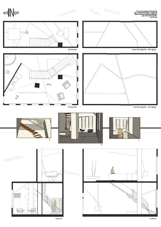
We all made another model! For this stage in Jenga, we were assigned one space to continue with; the one that held the most promise. We added an addition to either the top or bottom of that original space. My space was the 'in' the edge. So I continued with the same concept and translated that to an upstairs space that included another sleeping area and a work place. Overall, I think I really came through this time around for presentation. I had all the deliverables and more. That was what I was proud of the most. I divided and conquered all the requirements! As far as the layout of the board, I needed to take into account that all of the drawings were to scale. I could not make them smaller to fit better on the page. I had to work around it, figuring out the best way to communicate my ideas with several large drawings. At first, I wanted my perspectives to have a little color. Alas, at the end, that was not plausible. So I ended up having black and white, but think it turned out quite well; a happy accident!

As far as the class as a whole goes, I think we definitely stepped up to the plate and hit a triple. It was not quite a home run, but we came close. We still need to be aware of our layouts. I feel that they need more seasoning and flavor to them. Right now they are just the plain meat. So, we need to think about them along the way, not just at the end of the process. This is the same as our design process as well. We now know to design and produce at the same time. One does not come to a halt because you begin another. I am excited for this next time around; we are working in groups! I haven't worked with the people in my group yet, but it looks promising!

Here are some photos of the last phase in the project:

final stages of model...scale figures!

Tuesday, February 1, 2011

ClassmateCrits


Our class finally finished a part of this Jenga project. Here is what a few of them had up their sleeves:

Kacie Leisure began with a wonderful concept. 'Well-up' was the basis of her three rooms. She tackled the project in this way: the burst effect, elevate, and feeling. Beginning with the skinny room, she thought of the final burst whenever something wells up. The focal point and most interesting object (a column in this case) within this room showcased that process quite well. It began with shelves with space in between that gradually got smaller the higher you went. At the very top, it 'burst' into one long shelf. It was interesting the concept of bursting or exploding was flipped. Bursting is usually thought of as one thing becoming many. In this case though, she seemed to pull it off. In her next space, the square one, she focused on the elevation part of well-up. This manifested itself within the architecture (of course!) of the space. She incorporated all of the utilities of the space thoughtfully in these solids. Then the third space focuses on the actual feeling of welling up. She explores how it would look in a physical form and with many curves and luxurious fabrics/textures. For each one of these rooms, she made a model to coincide with it. These were made using the laser cutter. Kudos to her! The drawings that helped make out the space the best were the axonometric ones. You can see how it really made it easy to delve into the space.


Justin McNair showed an interesting perspective of his word as well. Spark was categorized into three other variations and then expounded upon. The three rooms were as follows: tension of striking something, the center or nucleus of that point, and the rawness of materiality. The tension room was quite interesting. He put the kit on edge, using much diagonal lines to showcase movement within the space. I think this was successful. The center, or nucleus of the spark exuded itself within the next space. Everything seemed to spread from a single point. Unfortunately with the last room, the connection with spark was not quite made. He did a great job of making it coincide with materiality, but no spark for me! All of his deliverables were informative, but the axonometric drawings really speak to the concept of his rooms and allow you to really be in the space.

Rooms with an Edge

I wanted to go through my rooms quickly, as if you we walking through the space, just to give a little more experience to the actual space.

On the Edge- This is the first space of the three. The thought I had behind this one was that you were constantly on the edge, either figuratively (about to figure out something) or physically (like on the edge), and wanted to explore and find out what was on the other side. As soon as you walk in, you are left with no choice but to go forward. There are walls on either side, with fogged glass in strips every so often, giving you a glimpse of what is behind the wall and causing you to want to understand the blurred shapes. When you reach the wall of windows, you now have two choices. Right or left? You can see a bit of stair to the right and decided to go that way. There are steps, leading up to the loft area. There is a bed right in the center of the room, and it looks as if it's floating. When you are on it, you are literally on the edge in the area. The walls do not reach all the way to the ceiling, making you have to go and look over the edge to the other part of the room. The only thing you can see here though, is a wall and then a red pipe coming up from the space. This intrigues you and you have to go down to check it out. The Bathroom is under the loft area and you check that out before continuing. Something is in the center of the room. You come closer and realize it's a sink, but wait! It is actually a bathtub if you lift the sink part up. On to the other part of the room. You walk out and around the walls, coming eventually to an area with seats, a table, and an old fashioned looking stove. That was where the pipe came from, you think. The room has now been figured out.

In the Edge- This room focuses on mentally being in the edge (between here and there, and having much tension), and is shown throughout with the architecture. When you walk in, the door swings and all you see is wall. This is kind of unnerving, but you continue on. Your eye is drawn to two columns toward the center of the room. These are not ordinary columns. They have steel cables coming from every which way and attach to the walls. You notice that there are several floor changes. The kitchen area is to your right, a straight, streamlined, no frills counter space. When you look closer and investigate, you can see that there is a oven, refrigerator, and sink. They are just hidden. There is a table between the two columns for eating. You continue on and see that there is a sitting area with brightly colored, what I would call 'edgy' chairs. Around the corner from that is the sleeping area. The bed frame has a frame but instead of being a box like, normal thing, it has two corners and that's all. the last place in the room is separated from everything else by a diagonal wall. It holds the bathing area. There are two shower heads in the shower, furthering that idea of being in between. I would also like to point out that the lights run along each level change, accentuating the edges of the various areas in the room.


Over the Edge- For this room, I wanted to look at it as going crazy, where things are not as they seem. When you walk in, the door opens so you see this thing at the end of the room. You figure out it's a tree. Well, an abstracted tree. The roots are shown on the ceiling as blocks and the top of it is on the ground, represented by green carpet. There are pillows on the ground, where it seems comfortable to sleep, surrounded by a lush green forest. Now, the reason your eye went directly to this tree was that there were walls on either side of the door, the angle small and then growing larger toward the tree. So, on the other side of these walls, the world is different than the lush green on this side. It has light, natural colors and smooth textures. The floor is a light wood opposed to the dark green carpet on the other side. Behind one wall is the bathing area. This bathroom holds a toilet and bathtub. There is actually two tubs, one inside the other so that the water can flow 'over' into the other one. The eating area is on the other side and is composed of a circular kitchen. It has everything in it and can be closed. A table springs out from it as well. There you go, a room that has two contrasting themes but yet the idea of crazy rolled into one.


Monday, January 31, 2011

The Edge


We finally finished the first installment of our three room project. It was an intense work week, but it was worth it in the end. Here are some photos of the process and then the final.
Sketch model of over the edge
Sketch model of on the edge
Pieces to cut out using the scroll saw
Close-up of those pieces; the holes on the corners are to help make the turn better with the saw

The scroll saw and my first cut!
All of the pieces left
Victory with one model!!
One of the models; just the bones
Another of the skeletal models; the light effect is pretty interesting
Putting the level changes in one of the models using chip board
The final "on the edge" model, parts and all!
Final "in the edge" model
Final "over the edge" model
Final presentation

Thursday, January 20, 2011

Short Narratives

'On' the Edge

My overall concept in this first room is ‘on the edge’. Upon walking in, walls of different height are flanking the entrance, leaving you no choice but to move forward. There are small glimpses as to what is behind them, but there is a mystery involved, and curiosity is drawing you in. You turn to the right and at the end of the corridor lies an edge of a stair; where could it lead? You have a feeling you are on the edge of seeing what you couldn’t see before. You come to a sleeping area. The walls are short, and when looking over from on top, you see what’s below. However, the other side is not completely revealed. You only see the top portion of a column. So, the entire room is not revealed. You travel down, finding a bathroom under the sleeping area. On the other side, you follow the wall to a food preparing and peaceful sitting place.


'In' the Edge

‘In the edge’ is the statement for this room. Upon walking into it, you find yourself elevated on a sleeping platform and are met with a sense of uneasiness. Though it is an open area, you feel as if you are being pulled every which way. That tension is elaborated by steel cables that form a tightrope-like joinery between the surrounding walls and the two columns set within the room. As you look around, there are several other level changes, all forming diagonal lines, or triangles in the floor. One is in the window corner where there is a meditation area. A food preparing area is located on the opposite side and next to it is a diagonal wall. It closes off the bathing area from the rest of the space. The opening to it begins small and gradually grows larger the further you go in the corner or edge of the room.


'Over' the Edge

In this space, things are not as they seem. First off, you take a step down that was quite unexpected. Then, illumination is coming from the floor, when it’s normally from the ceiling. You notice this column, which you discern as an abstract tree. You realize the floor is representing the leaves or foliage. Your eyes travel up to see the ‘roots’ stretching over the ceiling, at different levels and thicknesses. Around the base are sleeping areas. After this exploration, the stand-alone walls on the edge of the room are a different world and stand in stark contrast to the leafy, lush space. They are bright, crisp, and clean. One wall has the bathing and meditation areas. The other holds the food. The opposition of the two parts relate to going ‘over the edge’. Hatters (mad as) could have a perfectly opposite, upside down day. The next could be on the contrary; vivid, peaceful, and focused. This space defines both of those situations.


Wednesday, January 19, 2011

Design Auto Biography II

I wanted to tell a little about my background in design thus far. Since I was very young, I have been tagging along with my Dad at a one man (well, woman) design firm. I would help him with his work: painting, installing, moving, fixing, etc. Along with this, I was able to observe the inner workings of the firm. I believe that this is where my love for design came from. Other experiences, especially taking interior design in high school, helped me to realize that this what what I wanted to do as a career. For my senior project, I made a cabinet with the help of my Opa (grandpa). That was a huge learning experience and I actually used the final product for the IARC application; answering the question, what is something you think to be well designed? I then came to UNCG and began my studies. I found a job at Stein Mart over the summer and learned so much, especially about marketing and selling. At the past Furniture Market in High Point, I received the opportunity to help stage the Asian Loft showroom. They then made it available to work the Market; I sold a vase! That was truly a great experience. I am believing to continue design and love it as much now and in the future as I have in the past.
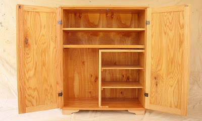
The photo here is of the cabinet I built with Opa. This product of mine is my inspiration for great craft. I put in the hard work and dedication and it definitely shows.

Thursday, January 13, 2011

Yes, ideas.

It looks like I have come out of that rut I was in! Here is a parti about my ideas...and yes, some are supposed to be upside down.


Monday, January 10, 2011

Design Auto Biography

I wanted to take the time as well to tell a little about my background in design thus far. I have been tagging along with my Dad at a one man (well, woman) design firm since I was two years old. I would help him with the work he was doing for her (the designer): painting, installing, moving, fixing, etc. Along with this, I was able to observe the inner workings of the firm. I believe that this is where my love for design came from and other experiences helped me to understand that. In high school I thought it would be fun to take an interior design class. That was where I realized this is what I want to do. For my senior project, I made a cabinet with the help of my Opa (grandpa). I used the final product for the application to attend IARC; answering the question, what is something you think to be well designed? I then came to UNCG and began studying design. I found a job at Stein Mart over the summer and learned so much, especially about marketing and selling. At the past Furniture Market in High Point, I received the opportunity to help stage Asian Loft’s showroom. They then made it available to work the Market; I sold a vase! That was a great experience. I believe to continue design and love it as much now as I did in the past.
The photo here is of the cabinet I built. One of my goals this semester is that everything I make have great craft. This is my inspiration for great craft. It does take hard work and dedication, but the end result looks fantastic, and I am proud of what I accomplished in the end.

Goals.

Hello again! I am back, ready to start a new year and believing it will be ten times better then the last. To start, I want to list out the goals (focusing on design) I believe to achieve this year:

  • Better Time Management (I think I am doing well so far, I have read half of what is due on Friday and have written this tonight which is due on Wednesday!)
  • Work whole-heartily on my work even if I am not into the task
  • Work at how I communicate ideas, which incorporates:
o Drawing
o Rendering
o Layout
  • Good craft in ALL endeavors, not only wood working
  • Ask questions and get involved (specifically during class). I think of great things to say after the fact.
  • Learn to be a strong leader. Not be afraid to speak up and say what needs to be said, specifically in groups.

My strengths as a designer (that I will continue to work on) are as follows:

  • Anything digital
  • Carrying out directions and following through.
  • Choosing colors/patterns that work well with each other

I was told a few more strengths I have:

  • Organized
  • Attention to detail
  • My design style is solid, but curvy and graceful, relating almost to Art Nouveau
Our class took a personality quiz today which was enlightening. It put us into a line with three areas; conservers, pragmatists, and originators. I was in the middle with the pragmatists. We are the mediators that balance out situations. We share leadership willfully but at the sometimes will take everyone agreeing over having a great final product. It was great to see my classmates’ positions in line. It was shown that we need each of the areas to contribute for the best outcome. This was such a great idea for us as a group; I hope to keep using it in the future.

Tuesday, November 16, 2010

Reading Comprehension 6

1. A common theme of the early twentieth century found in Roth, Harwood, and Massey set the tone for an understanding of styles in architecture and design influenced by fine art. Selecting either Arts + Crafts or Art Nouveau, TRACE the influences of the selected style in more than two nations. In your answer, you should include evidence from the readings and at least two annotated images as support for your analysis of influences.

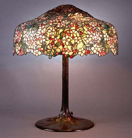
I am choosing to look at the Art Nouveau style in America, France and Germany. America does not jump on the bandwagon with this style because they are not into 'the style's associations with decadence, the erotic, and socialism' (Harwood 484). The main places that you see this style become apparent are in art glass, ceramics, decorative painting and specifically lighting by Louis Comfort Tiffany. So this style mainly stayed within the confinements of accessories here in America.

Image found here

Now for France, people embraced this style. They wanted to stay above the curve of design and so introduced schools to teach Art Nouveau. Many people thought that the style helped with living conditions. It was then configured into the design of private buildings.

Image found here

Though Germany was searching for that national identity, they did not gain it with Art Nouveau. The movement of Art nouveau there was called the Jugenstil (young style). These young people focused on the interrelations of designer, craftsman, and manufacturer. This eventually led to the inspiration of the Bauhaus school. Germany was also like America in the fact that this style had a minimal effect on architecture and more on artifacts.

All of these nations, whther focusing on architecture or more on accessories, they began with quite fluid, moving, curvilinear non symmetrical aspects and transition in 1900 to having more straight linear moments within the design. Some of them (like the Glasgow School of Art's library shown below) even to the point that I could hardly tell they were considered to be during this era.

Image found here

2. Originating at the Bauhaus and in the work of LeCorbusier, the so-called Modern movement deeply influenced design and architecture of the twentieth century. The great debate raised by this new approach to design involved the presence of the machine in the design process and final products. SPECULATE about the implications of “machines for living” and the famous dictum “less is more” on design today. Use at least one ARTIFACT, SPACE, or BUILDING in your answer, providing a salient image (cited) and annotation to help bolster your argument.

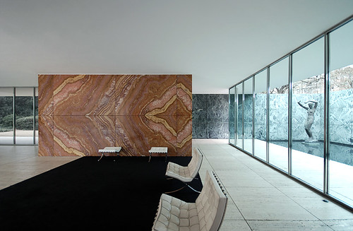
To figure out today, we must first look back to past years to Ludwig Mies van der Rohe. He designed the German Pavilion in 1929, around the sole fact that less is more. Harwood states that Mies’s stlye is “severely plain, geometric…that relies on careful proportions, precise details, and opulent materials rather than applied ornament for beauty.” I think this is stated quite well and depicts the intention of the space. I think that Mies possibly wanted to show that even through this time of depression, things could still be beautiful without lavish furnishings and decorative accessories, things people could not easily obtain during this time. Looking now to the present, I believe we strive for this same concept; at least I do. I would rather save and live comfortably than splurge on big ticket items or many various items. I make do with the things I have and try to use them as efficiently as I can. I would love to do this in design, as I have seen already. I believe there is a show on HGTV that incorporates using the same things one already owns to revamp a space. Reusing your things to save big!

Machines help to save time and money. In the German Pavilion, machines were used as we learned in class to help form the onyx walls. I am sure it saved money by the pieces being manufactured, but someone, a person, still had to install these pieces, therefore ultimately requiring human help. Some machines, like stoves or even microwaves allow us to get things done faster that would have taken longer a few centuries ago and required actual burning wood. In this case, without these machines, how would we go about our daily lives? How could we cook without them?

Image found here
This image of the German Pavilion articulates what I was referring to in the above writing; the de materialization of the space, the simplistic 'less is more' motto is shown very clearly I think.

3. From the assigned pages in Roth, Harwood, and Massey, SELECT an image that you believe explodes the notion that Modern interiors and objects were black and white. Fully RENDER your own design exploration of that image through color, material, and light and appropriately annotate and cite the image to prove this point.
The original image:
Image found on pg 506 in Harwood
Rendered Image: