Tuesday, March 15, 2011

Illustrator Rendering

This next rendering is from Illustrator. On this time around, I thought it would be fun to try something completely out of the box. Literally. I took the walls down and left nothing but the stairs from the wire frame. I throughly enjoyed this working on this rendering more so than the other because it has a whimsy and fantastical atmosphere surrounding it. The things I can improve on are the light rays. I have not figured out how to get them to have the streaks like the background does, but I still think they turned out fairly well. I really enjoy the hanging flower pods. I think they add much depth to the scene, though I need to continue (yet again) to work on the shadows of the pods, specifically where they would fall.

Photoshop Rendering

In my digital design class we are working with various programs to produce renderings from only a wireframe. We are to include entourage: color, texture, scale figures, etc. We could manipulate the wire frame into anything we wanted. With this first one rendered within Photoshop, I decided to take a more artistic approach instead of photo realistic. I turned out quite interesting. I think something I will continue to work on is shadows and light sources as well as the context. What is behind the windows? I kind of took the easy way out and put a gradient of blue with that area.


Jenga 5.0 Charrette

The charrette we engaged in on Monday was quite illuminating. It was revealed to me (whilst in the process) that lack of time is not a crutch; it is, in reality, sometimes an unavoidable obstacle and greater help. You are able to exert your brain to go, and even exceed that extra mile. The first group (Beaucoup) that we conversed with allowed the flexibility and balance that our group needed to thrive in order to produce an optimum result. We all proposed some intriguing ‘seed’ ideas, ones that could take off and grow big. You might think ‘wow; she came up with that opinion pretty quickly’. In reality, I realized this after we met with the second group (Jive). I could see, subtly at first, that we weren’t jiving (no pun intended!) with this group. None of us were truly enthusiastic about the joining of our groups. Whether it was from really diverse concepts or that we were tuckered out from the previous hour charrette, who knows. Regardless, when we came together, the attitudes seemed focused on just completing the assignment. Do not confuse this with believing it is not a good outlook; on the contrary. It is the best stance to have, however, in this case it was done with hardly any flourish; and I like flourish (it’s more fun)! We all jumped into our individual assignments and worked, completing them in a timely manner, but not actually doing our best design work (at least in my opinion).

The deliverables I completed were the following:

Beaucoup parley - concept sketches

Jive stint- statement (but really a paragraph) of approach

Monday, March 14, 2011

Jenga 4.0

This is Jenga 4.0. We were required to have only one deliverable; we could choose what that could be. Do not let the ONE deliverable allow you to think this was by any means easy. Our focus? To showcase one thing that best demonstrates the key design idea. In thinking about feasibility, one photo or model would (most likely) not do our design justice. Our group decided to put together ONE board. We included as many things as we possibly could, as you can see. I have to say that I am extremely proud of this board. I think the layout is great; everything is alined in a grid format, making it easy to follow the progression of our 'powers of ten ' theme. It is divided here into two parts by the thin vertical line. On the left are the drawings that showcase the complete composition of the structure. You then move to the other side of the line and it begins on top with the four exterior shots. Each of these continue down the board, further into the building, looking at the sections and then the perspectives. Beneath these are the diagrams of individual concepts included within the structure. Even though each one of us was working on different parts of the board, the colors flowed together well. At the beginning, I had some difficulties of really putting my heart into this project but, towards the end, things came together nicely.

Wednesday, February 16, 2011

Jenga 3.0 Process

We are in the process of combining three individual spaces from the class into one big unit, complete with public areas for people to commune together. Here is a diagram that I am using to show how we laid out the top floor vs. the bottom. The circulation is also articulated here by dots and arrows. I have included a narrative of the circulation and feeling of the unit as well. I am excited to really push down the gas and get moving on the actual interior design work.

Our whole unit is comprised of three individual private spaces. As they come together, a circulation pathway manifests itself within the inner area. This is a two story area and can be entered two ways. Enter one way and you are near one of the private spaces, a stairway, and a reception/office space. If you come in the other way, you are close to the second private space as well as another staircase. If you proceed to travel up the stairs, they lead to the second story. This area includes a door to the other private space, a restaurant, casual seating, and an outdoor terrace. The private and public spaces are married together in a number of ways. Materials are an important factor here. Throughout all of the spaces, the concept revolves around slants, protrusions, and dynamic flow.


Another beginning part of our assignment was to illustrate main concepts of the book we read. Each of us in our group made an individual collage of ideas and interpretations of our book. The one I had the pleasure to read was the Ice Palace that Melted Away by Bill Stumpf. It was a fun read. Stumpf expounded upon better designs of several well known objects and experiences, which was quite interesting to me. I catch myself thinking quite often how certain things would work more efficiently, and he shares in my breaking down of details mind-set.

Sunday, February 13, 2011

Jenga 2.0

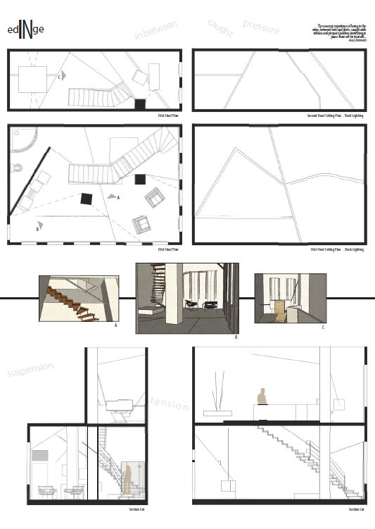
We all made another model! For this stage in Jenga, we were assigned one space to continue with; the one that held the most promise. We added an addition to either the top or bottom of that original space. My space was the 'in' the edge. So I continued with the same concept and translated that to an upstairs space that included another sleeping area and a work place. Overall, I think I really came through this time around for presentation. I had all the deliverables and more. That was what I was proud of the most. I divided and conquered all the requirements! As far as the layout of the board, I needed to take into account that all of the drawings were to scale. I could not make them smaller to fit better on the page. I had to work around it, figuring out the best way to communicate my ideas with several large drawings. At first, I wanted my perspectives to have a little color. Alas, at the end, that was not plausible. So I ended up having black and white, but think it turned out quite well; a happy accident!

As far as the class as a whole goes, I think we definitely stepped up to the plate and hit a triple. It was not quite a home run, but we came close. We still need to be aware of our layouts. I feel that they need more seasoning and flavor to them. Right now they are just the plain meat. So, we need to think about them along the way, not just at the end of the process. This is the same as our design process as well. We now know to design and produce at the same time. One does not come to a halt because you begin another. I am excited for this next time around; we are working in groups! I haven't worked with the people in my group yet, but it looks promising!

Here are some photos of the last phase in the project:

final stages of model...scale figures!

Tuesday, February 1, 2011

ClassmateCrits


Our class finally finished a part of this Jenga project. Here is what a few of them had up their sleeves:

Kacie Leisure began with a wonderful concept. 'Well-up' was the basis of her three rooms. She tackled the project in this way: the burst effect, elevate, and feeling. Beginning with the skinny room, she thought of the final burst whenever something wells up. The focal point and most interesting object (a column in this case) within this room showcased that process quite well. It began with shelves with space in between that gradually got smaller the higher you went. At the very top, it 'burst' into one long shelf. It was interesting the concept of bursting or exploding was flipped. Bursting is usually thought of as one thing becoming many. In this case though, she seemed to pull it off. In her next space, the square one, she focused on the elevation part of well-up. This manifested itself within the architecture (of course!) of the space. She incorporated all of the utilities of the space thoughtfully in these solids. Then the third space focuses on the actual feeling of welling up. She explores how it would look in a physical form and with many curves and luxurious fabrics/textures. For each one of these rooms, she made a model to coincide with it. These were made using the laser cutter. Kudos to her! The drawings that helped make out the space the best were the axonometric ones. You can see how it really made it easy to delve into the space.


Justin McNair showed an interesting perspective of his word as well. Spark was categorized into three other variations and then expounded upon. The three rooms were as follows: tension of striking something, the center or nucleus of that point, and the rawness of materiality. The tension room was quite interesting. He put the kit on edge, using much diagonal lines to showcase movement within the space. I think this was successful. The center, or nucleus of the spark exuded itself within the next space. Everything seemed to spread from a single point. Unfortunately with the last room, the connection with spark was not quite made. He did a great job of making it coincide with materiality, but no spark for me! All of his deliverables were informative, but the axonometric drawings really speak to the concept of his rooms and allow you to really be in the space.