Friday, March 16, 2012

IARC core values

Talking about core values in IARC... photos and writing; tried to consolidate my writing.  

Wednesday, February 29, 2012

Feedback: Corry

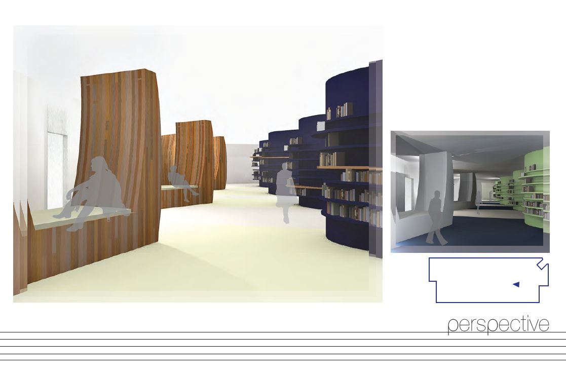
Looking at and analyzing Corry Mears' project was fun. I was not able to pull photos from his blog, but they are worth looking at! Go here to see them. I really enjoy the graphic style he uses; it is so simple to understand. As far as this project goes, I think he did a great job in listening and communicating the problems and solutions in the space. He included many ideas that were quite innovative. One that I particularly liked was the bookshelves that could slide into the wall, which made space to include an area to hold an event or presentation; this was a nice touch. I like the idea of a café as an area in the library. The smooth rolling wood element on the ceiling is a nod back to Corry’s concept of silent music in that it relates to the continual movement of music.
One of the things I wish he would have included was an office area. The librarians appreciate having their own space now and taking that away is a crucial decision. He definitely laid out the space well, with different uses clearly communicated but I think that the offices should have been included within those parameters. I also would have liked there to be a key plan on each of the pages. The main floor plan was great in that it included where the perspectives, details, and finishes were located but I needed to refer back to them as I was looking through the individual pages. Overall though, even with these small adjustments, I could see this as a legitimate library.         

Monday, February 27, 2012

Music Library Design

Tomorrow is the big day! Here is the link to my presentation for tomorrow. So excited to show what I've been working on and what everyone else has as well.

Presentation

Monday, February 20, 2012

Group decisions/moving ahead with the Music Library

As a group, we had to make some executive decisions about designing the Music Library. These were our thoughts: 
  • We are NOT incorporating the bottom floor BUT need to include solutions as to where those LPs will be located.  
  • To get rid of the CDs/DVDs- they can be provided digitally  
  • Last one is still in the works.. What to do about the entrance/office/circulation area? It was stated that if we wanted to move them they needed to stay together.  
As far as what I need to do personally to move forward is begin to model the design digitally so that it starts coming together. I need to be solution-minded to make these decisions work in the space. It will be an intense week of design, but I am ready for it. Bring it on! 

Wednesday, February 8, 2012

Feedback: Nicole


Nicole delivered a super fun space. I am reminded of Alice and Wonderland somewhat because of the color choices and the style of rendering. The space is full of and impactful with color, which is a great concept in a music library.

The columns have been given a face lift and actually make a big (positive!) impact in opposition to what they were like previously. This take on structure is interesting. She really played up the horizontal structure here and celebrated it. While making them stand out, she made them an integral part of the space; I would not know they were structural columns. This was a success I think. The next step I think would be continuing the idea on the floor as she has done on the ceiling. The space almost feels top heavy so to continue this installation on the floor would help balance that.  
The nodes in the space are placed in this grid like system which have positives and disadvantages associated with it. First of all, it provides structure and defines the area which is great in assisting with boundaries, but I think it might be too structured. With all these flowing curves, introducing square areas breaks up that concept.
The next step I would suggest is in reference to quiet and loud sections. I love that it has a café area (I might have to incorporate that in my design!) which goes along with the social aspect. But the actual library is social as well. I think that quiet, listening areas should be established. The curved panel divider is slowly traveling in the direction of this idea, and just needs to be further implemented. I am excited to see the next few iterations!      

90 second presentation

The next step in analyzing and designing the libraries, our class looked at several pieces of writing, presentations, and surveys about libraries in general and then our campus libraries specifically. Aws and I looked a survey entitled: Institutional Effectiveness of 2010-2011. We found many important aspects that definitely need to be incorporated into our final design. The information displayed here made us change our minds in how we thought about a library. We learned specifically three new things: librarians are being trained to better serve in the customer service capacity, technology is being integrated as a vital aspect of the space, and the most asked question is how to cite correctly. Obtaining this knowledge allowed us to explore new instances with our designs. Having 'citation stations' where users could type in a book and having it cited for them would be greatly appreciated, along with a substantial amount of desktops, and a central or easily noticeable customer service area are all ideas we plan to integrate in the next phases of this project.      


Sunday, February 5, 2012

Library Presentation

The next step in our library design was to actually design the interior. We focused on a concept and went from there. My concept is Reverberation. I saw that through all the hard angles within the building and site there are three circle areas: the organ recital hall, lobby, and little pond outside. I used radiating circles that reverberate from each of them. These arcs were used for either the ceiling, floor, or pieces in the space. These were my presentation boards: